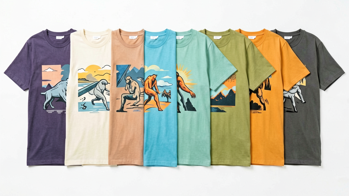
How Do You Choose a Graphic Tee Design That Actually Matches Your Style?
Choosing a graphic tee that actually matches your style comes down to a 5-step filter: pin down your visual identity, match it to your existing wardrobe, pick a print scale that flatters your...
Sylvie Vance
•
Choosing a graphic tee that actually matches your style comes down to a 5-step filter: pin down your visual identity, match it to your existing wardrobe, pick a print scale that flatters your frame, vet the fabric and print method, and check whether the brand's voice matches yours. Most shoppers skip the last step and end up with a shirt they love on the model but never wear in real life. The tee on the product page is the same shirt in your closet — so the filter has to work for *your* closet, not theirs.
Step 1: Define Your Visual Identity
Before you scroll a single product page, lock in three things about yourself: your dominant palette, the motif vocabulary you're drawn to, and the mood you want the shirt to broadcast. This is your visual ID, and it filters out roughly 80% of the catalog in one pass.
Palette. Pull out the 5 tops you wear most. The two colors that keep showing up are your anchors. Anything that fights those colors will sit in your drawer unworn.
Be honest: are you a typography person (band logos, slogans, type-only compositions), an illustration person (characters, scenes, objects), or an abstract person (shapes, gradients, distressed print)? Each tribe reads differently on a chest.
Motif.
Mood. Loud-and-playful, dark-and-minimal, retro and faded, or graphic-novel-serious. Pick the lane you'd describe in one sentence to a friend, and ignore anything that sits in a different one.
Step 2: Match the Tee to Your Existing Wardrobe
Now reverse the filter: take your visual ID and audit your closet for what it can be worn *with*. A graphic tee earns its hanger space on the days it pairs with two or more bottoms you already own. If it only works with one specific pair of jeans, it's a costume piece, not a wardrobe staple.
Neutral tees earn first. A black tee with a single-color print pairs with denim, chinos, cargos, and shorts. A loud multicolor tee usually pairs with one. Buy neutrals first; louder prints come later as accents.
Watch the undertone. Warm neutrals (cream, stone, rust) clash with cool-leaning graphics. If your closet skews warm, skip icy blues and silver inks.
Layered = two tees. A muted graphic tee under an open overshirt needs to read at the chest band. Big center-chest prints disappear; small left-chest prints survive.
Step 3: Pick a Print Scale That Flatters Your Frame
Print scale is the single biggest factor in whether a graphic tee flatters or fights your frame. Most shoppers skip this and end up in a shirt where the print looks like it wore them, not the other way around.
Small frame (under 5'8" / slim build). Stick to prints under ~9 inches wide. Center-chest or left-chest placement. Anything bigger visually swallows your shoulders.
Average build. You can carry full-front prints in the 10-12 inch range. This is the sweet spot for classic band, pop-culture, and streetwear graphics.
Tall or broad. Go bigger or go home — 12+ inches, edge-to-edge prints, sleeves-with-graphic constructions. Smaller prints look orphaned.
Rule of thumb. The print should occupy roughly 35-45% of the shirt's front surface. Less reads as a logo; more reads as a poster.
Step 4: Check the Fabric Weight and Printing Technique
A great design on bad fabric is a 4-wear shirt. Fabric weight and print technique decide how long the graphic survives, how the tee drapes, and whether it shows sweat, lint, or pet hair. Two technical specs on the product page tell you almost everything.
Fabric weight: 180-220 gsm (grams per square meter) is the sweet spot for year-round wear. Under 160 feels flimsy and prints sit on top of the cotton; over 240 is heavy and can feel stiff until broken in.
100% cotton vs blends. Pure cotton breathes and takes screen print cleanly; cotton-poly blends are softer and more wrinkle-resistant but DTG prints fade faster on the poly content.
Print technique. Water-based and discharge inks soak into the cotton fiber — soft hand, ages well. Plastisol sits on top — bold and crisp, but cracks faster. DTG is photo-realistic at launch, mediocre by wash 30.
Step 5: Vet the Brand's Story and Design Intent
Last filter, and the one most shoppers skip: does this brand actually make shirts for someone like you? A tee is a small piece of wearable branding. If you wouldn't wear the brand's logo on a hoodie, don't carry it on your chest at 6-foot viewing distance.
Read the about page. Independent streetwear brands with a stated point of view (pop art, retro, motorcycle, skate, etc.) tend to be more consistent than fast-fashion drops that change aesthetic every season.
Check the drop cadence. Drop-counted brands (4-8 collections/year) are usually design-led. Endless-SKU brands are usually merch-led.
Pricing tells. Tees under $20 with elaborate prints almost always skimp on fabric weight or print method. $35-55 is the honest range for a well-made, well-printed 200gsm graphic tee.
Look for fit notes. Brands that publish chest width, length, and shrinkage specs care about construction. Brands that hide those numbers usually don't.
Key Takeaways
Define your visual ID first — palette, motif, mood — before you shop.
Match the tee to two-plus outfits you already own, not to one fantasy outfit.
Right-size the print to your frame: 9" for small, 10-12" for average, 12"+ for tall or broad.
Insist on 180-220 gsm fabric and water-based or discharge ink for longevity.
Buy from brands whose visual voice is recognizable, not from endless-SKU generic drops.
The Bottom Line
Run any graphic tee you're considering through this 5-step filter and you'll cut your returns, your drawer orphans, and your "I bought it because the model looked great" regrets in half. The Stryxen Studio collection is built around the same filter — every drop is built on 200gsm cotton, water-based inks, and prints scaled to flatter a range of frames rather than just the fit model. Pick the visual lane that fits you, then trust the spec sheet.
Frequently Asked Questions
What graphic tee fits the best for a short guy?
Short and slim frames should look for left-chest or small center-chest prints under 9 inches wide, paired with a regular or slightly tapered fit. Oversized cuts combined with big graphics make a smaller frame look like the shirt is wearing you, not the other way around.
How do I know if a graphic tee is good quality?
Check three specs on the product page: fabric weight (180-220 gsm is the sweet spot), fiber content (100% cotton breathes and prints cleanly), and print method (water-based or discharge ink ages better than plastisol or cheap DTG). A $35-55 price range usually corresponds to all three being right.
What color graphic tee goes with everything?
A black or charcoal graphic tee with a single-color print pairs with denim, chinos, cargos, shorts, and most overshirts. White is a close second, though it shows sweat and pet hair more easily. Cream and stone tones work in warmer wardrobes.
Are expensive graphic tees worth it?
Above roughly $60 you're paying mostly for brand equity and design intent, not fabric or print — the tee itself isn't dramatically better than a $45 well-made one. Below $25, you're almost always trading away fabric weight or print quality. The honest price band for a graphic tee that holds up is roughly $35-55.
Free Shipping on All OrdersFree ReturnsNo Hidden Fees
 Sylvie Vance