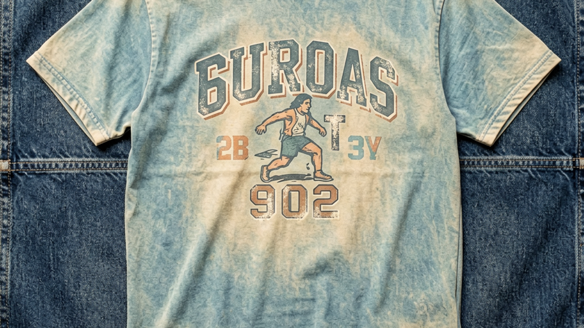
What Is a Retro Vintage Graphic Tee and Why Does It Never Go Out of Style?
The fastest way to choose a graphic tee that actually matches your style is to run every design through a five-step filter: art style, motif, color palette, print scale, and brand voice. Most...
Sylvie Vance
•
The fastest way to choose a graphic tee that actually matches your style is to run every design through a five-step filter: art style, motif, color palette, print scale, and brand voice. Most buyers skip four of those five, then wonder why the shirt they loved on the product page sits untouched in their closet. The fix isn't more scrolling. It's a tighter decision frame. This guide walks through each step with the same level of scrutiny you'd use before buying a pair of premium sneakers, so every tee you add pulls its weight in your rotation.
Step 1: Define Your Visual Identity Before You Browse
The product page is a terrible place to discover what you like. The drop-down filters, the lookbook photos, the model posing in flattering light — all of it is engineered to override your taste. Start with a mood audit instead. Open your camera roll, your saved Instagram posts, or even a folder of album covers you stream on repeat. Look for the visual patterns that keep appearing.
Pull out three things:
Color family. Do you consistently drift toward earth tones, monochrome, neon, or washed-out pastels? That's your palette baseline.
Motif vocabulary. Skulls, roses, cyber sigils, abstract brushstrokes, vintage typography, anime line work — most wardrobes have a hidden 2-3 motif shorthand.
Mood register. Are your references gritty, romantic, futuristic, or naive? This is the difference between a tee that reads as 'cool' versus 'trying too hard.'
Write these down in plain language. 'I wear earth tones, I like hand-drawn and abstract motifs, my register is laid-back with a slight edge.' That one paragraph is now your filter. Anything on the product page that doesn't survive contact with it is a no.
Step 2: Match the Tee to the Wardrobe You Actually Wear
The best graphic tee in the world is the wrong one if it doesn't share a color story with the jeans, jackets, and sneakers you reach for weekly. Stand in front of your closet for ten seconds. Note the dominant hues of the five pieces you wear most. A vibrant magenta tee is a tough sell when your rotation runs gray, black, olive, and raw denim.
This doesn't mean you have to buy neutrals. It means you should know whether the tee is the loudest thing in the outfit or the third-loudest. If your base wardrobe is loud — say, bold outerwear and statement pants — a calmer graphic tee balances the silhouette. If your base is quiet — white tees, indigo denim, minimalist sneakers — a graphic tee is the focal point, so its palette carries more weight and should be chosen with more care.
One practical shortcut: hold the product photo of the tee up next to a photo of three items from your closet. If the colors fight, keep scrolling. If they nod at each other, you've found a real fit.
Step 3: Pick a Print Scale That Flatters Your Frame
Print scale is the most overlooked variable in graphic tee shopping, and it's the one that separates a shirt that looks intentional from one that looks like a costume. A chest-spanning back print on a 5'7" frame with broad shoulders reads as confident. The same print on a 5'4" frame can swallow the whole upper body and shrink the wearer visually.
Use this rough guide:
Petite or narrow frame. Lean toward chest prints under 10 inches wide, left-chest hits, or stacked vertical graphics. Avoid full-front landscapes and oversized back prints.
Average build (5'8"–5'11", medium frame). Most scales work. Center-chest prints in the 10–14 inch range are the safest, most versatile choice.
Tall or broad frame. Back prints and oversized front graphics have room to breathe. This is where maximalist streetwear prints actually shine.
Curated or layered look. Smaller prints, tonal graphics, and embossed or textured designs layer cleanly under overshirts, flannels, and chore coats.
The same tee can be the right brand and the wrong scale. Don't compromise on this one — sizing up or down won't fix a print that fights your proportions.
Step 4: Check Fabric Weight and Print Technique
A great design printed on bad fabric dies in the third wash. A mediocre design printed well can outlive three years of weekly wear. This is the part of the product page that 90% of shoppers skip, and it's where the cheap tees get exposed.
Look for three things on the spec sheet or product description:
Fabric weight between 180–220 gsm. Below 180 and the tee goes sheer and loses shape. Above 220 and you're wearing a heavy summer hoodie. Mid-weight cotton or cotton-poly blends in this range drape well, hold their shape, and take prints cleanly.
Print method matters. Plastisol screen prints are durable but can feel heavy and crack after years of wear. Discharge prints dye the fabric itself, so they age with the shirt and feel soft. Direct-to-garment (DTG) prints carry the most detail but vary wildly in quality — check close-up reviews.
Stitching and seams. Look for double-needle stitched hems, taped neck seams, and side-seamed construction. These are the boring details that separate a tee you'll wear 50 times from one that falls apart at the collar after five.
If the product page doesn't list fabric weight or print method, that's a red flag. A brand that's proud of its construction tells you. A brand that's hiding it usually is.
Step 5: Vet the Brand's Story and Design Intent
Two graphic tees can look nearly identical on a product grid and be made by brands with completely different intentions — and that intent shows up in the finished garment. A brand that designs in-house, sources ethically, and releases cohesive drops is building a world you're stepping into. A brand that's reselling Alibaba blanks with a transferred print is shipping a commodity.
Spend four minutes on each of these checks before you buy:
Look at the archive. Does the brand have a consistent design language across multiple drops, or is every release a different visual idea? Consistency is a signal of intent.
Read the founder's note or 'about' page. You don't need a manifesto. You need a clear answer to 'why does this brand exist?' If the answer is vague, the design probably is too.
Check the production details. Where is the tee made? Where is the fabric sourced? Brands that publish this are usually confident in the answer.
Reverse-image search the graphics. A distinctive, original illustration is worth more than a generic stock vector that's been used by 200 other shops.
This last step is also where you decide whether you want to support the brand long-term. A great graphic tee is the entry point to a relationship with a label, not a one-time transaction.
Key Takeaways
Filter by art style, motif, palette, fit, and brand voice — never buy on the first two alone.
Audit your existing wardrobe first, then shop. A tee that fights your jeans is a tee that won't get worn.
Print scale should flatter your frame — petite builds need smaller graphics, broader frames can carry oversized prints.
Fabric weight of 180–220 gsm and a named print method are non-negotiable quality signals.
Vet the brand — consistent design language, transparent production, and original graphics are the markers of a label worth supporting.
Where to Go From Here
Choosing a graphic tee that actually matches your style isn't about finding the loudest design or chasing whatever's trending on social media. It's about applying the same five filters every time — visual identity, wardrobe match, print scale, fabric and technique, brand intent — until the decision frame is so clear you can scan a product grid in seconds and know what belongs in your closet.
The Stryxen Studio collection was built with exactly this filter in mind. Every drop is designed in-house with a consistent visual language, printed on mid-weight cotton using techniques chosen for how the tee ages over years of wear, and released in palettes that slot into real wardrobes — not just lookbook fantasies. Browse the latest release and run it through the five-step filter yourself. You should be able to tell within a minute whether a piece is for you, and the answer should be confident, not hopeful.
Frequently Asked Questions
What makes a graphic tee look good instead of cheap?
Three things separate a good graphic tee from a cheap one: mid-weight fabric (180–220 gsm), a named print technique like discharge or high-quality plastisol, and double-needle stitching at the hems. A design can be incredible on screen and still feel thin, plasticky, or fragile on the body. Always check the spec sheet before you buy — the brands that care about construction tell you about it.
How do I know if a graphic tee matches my personal style?
Pull three pieces you already wear most often and look at their dominant colors, motifs, and mood. Then ask whether the tee shares that visual language. If your wardrobe is mostly earth tones and minimalist sneakers, a neon cyberpunk print is going to clash no matter how much you love the design. The fastest test is to imagine the tee in your closet, not on the model.
What size graphic tee should I buy?
Go true to size for everyday layering, or size up by one for a relaxed streetwear fit. The key is the shoulder seam — it should sit right at the edge of your shoulder bone, not drop down your arm. Print scale matters more than the tee size itself: a smaller frame can get overwhelmed by oversized back prints, so match the print size to your build, not just the letter on the label.
How do I keep graphic tees looking new after washing?
Turn the tee inside out, wash cold on a gentle cycle, and hang dry. Skip the dryer — the heat breaks down print fibers and shrinks cotton unevenly. For discharge and DTG prints, this routine will keep them looking sharp for years. If a tee can't survive this wash cycle, the print method wasn't built to last and that's a brand-quality signal worth remembering.
Free Shipping on All OrdersFree ReturnsNo Hidden Fees
 Sylvie Vance