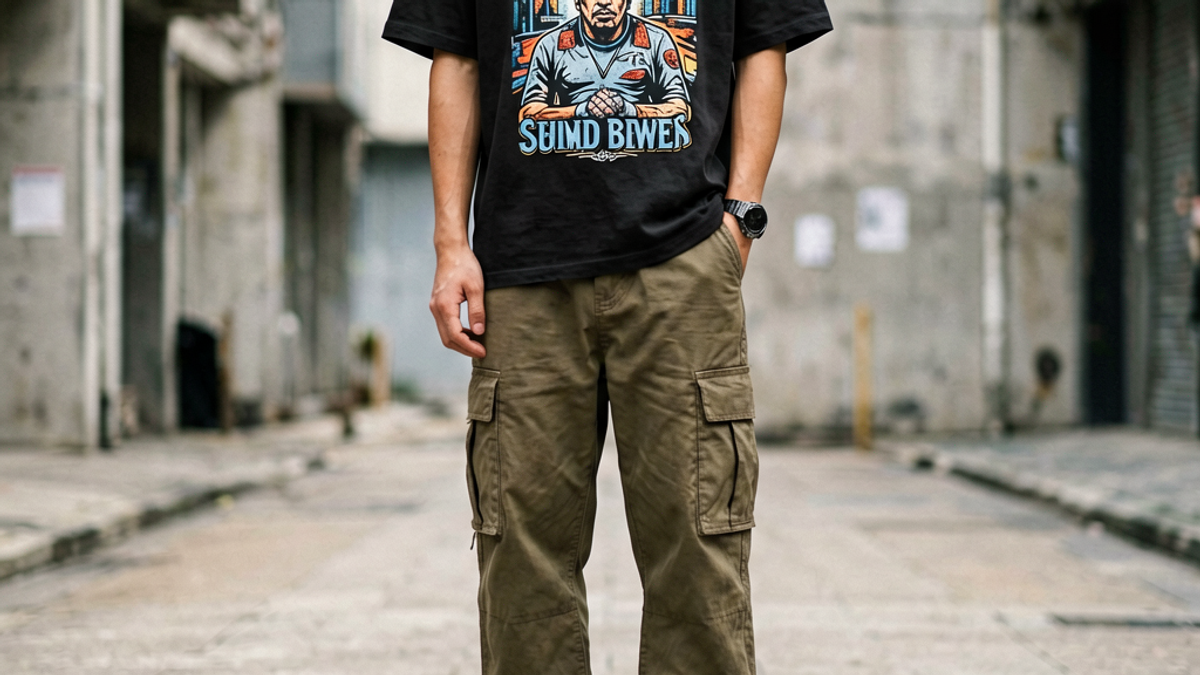
How Should Men Style Graphic Tees Without Looking Sloppy?
Men style graphic tees without looking sloppy by treating the tee as the statement piece and the rest of the outfit as the support system. That means plain bottoms, intentional outerwear, and...
Sylvie Vance
•
Men style graphic tees without looking sloppy by treating the tee as the statement piece and the rest of the outfit as the support system. That means plain bottoms, intentional outerwear, and either clean sneakers or deliberately broken-in boots. The mistakes that read as "sloppy" are almost always mismatched proportions, two loud pieces competing, or fit issues — not the graphic tee itself.
Key Takeaways
Fit is the foundation — sleeves should hit mid-bicep, hem should sit below the belt but above the crotch.
Let the tee do one job — if the graphic is loud, the rest of the outfit goes quiet.
Layer with intent — flannel, chore coat, denim jacket, overshirt. Each adds structure without competing.
Sneakers set the tone — clean white pairs toward minimal graphics; broken-in boots toward heavier designs.
Tuck or untuck is a deliberate choice — neither is sloppy by default.
Fit: The First Filter
Fit is the variable that decides whether a graphic tee reads as intentional or sloppy. Three checkpoints matter. Shoulders: seam should sit at the edge of your shoulder bone, not hanging down the arm or riding up the neck. Sleeves: hit roughly mid-bicep — sleeves that extend to the elbow make the torso look short. Hem: drops 2–4 inches below the belt, ending above the crotch. A tee that hits mid-thigh has lost the proportions that make it look like a shirt and not a dress.
Beyond those checkpoints, fit is a personal decision. Tailored fit (close to body, modern cut) works with small chest prints and clean designs. Regular fit (classic straight cut) is the safe default and works with most graphics. Oversized fit (dropped shoulders, longer body) works only with graphics designed for it — usually oversized back prints or full-front artwork. Putting a small chest print on an oversized frame makes both look wrong.
The Outfit Formula
Once fit is locked, the styling rule is simple: the tee is the lead, everything else is the supporting cast. Loud graphic? Plain bottoms in black, indigo, or stone. Quiet graphic? More room to play with patterned outerwear or textured pants. The exception is when the graphic tee is specifically designed to mix with patterns — usually a brand's most considered pieces. For everything else, plain wins.
A reliable outfit formula: graphic tee + plain bottoms (jeans, chinos, or raw denim) + one outerwear layer (flannel, overshirt, chore coat, denim jacket, or leather) + clean footwear (sneakers or boots). Five pieces total, one of which carries the graphic, the other four supporting. That formula covers most casual contexts without looking like you tried too hard or too little.
Layering That Works
Layering a graphic tee is where most outfits either come together or fall apart. The reliable choices are flannel (especially muted or solid color), chore coat (usually in cream, olive, or navy), denim jacket (raw or washed indigo, no distressing that competes with the tee), and overshirt (structured cotton or wool, hitting mid-thigh). Each adds structure without pulling focus from the graphic.
The unreliable choices are patterned or branded outerwear. A plaid flannel with a busy graphic tee reads as visual noise. A jacket with its own large back print fights the tee for attention. A graphic hoodie layered over a graphic tee looks like you're trying to wear two outfits at once. When in doubt, the outerwear should be one solid color in a neutral tone — the graphical contrast between the loud tee and quiet jacket is what makes the look intentional.
Footwear and Accessories
Sneakers do half the styling work. Clean white sneakers (Common Projects, Veja, AF1) lean toward minimal graphic tees — the outfit reads polished and modern. Broken-in canvas or vintage runners lean toward heavier graphics and vintage-inspired tees — the outfit reads lived-in and collected. Boots (Red Wing, Doc Martens, Thursday) lean toward workwear-coded graphic tees — the outfit reads rugged. Match the sneaker energy to the graphic energy and the outfit holds together.
Accessories should support, not compete. A single piece — a watch, a chain, a ring, a cap — is fine. Three or more accessories with a graphic tee start to read as costume. The exception is when the accessories are part of the same brand system as the tee; then they're contextual, not decorative. Otherwise, restraint is the move.
Common Mistakes to Avoid
Four mistakes make graphic tees read as sloppy, in order of how often they happen. Fit failures — sleeves too long, hem too low, shoulders hanging off the frame. Competing graphics — loud tee with loud jacket, loud tee with loud pants, two statement pieces in one outfit. Wrinkled presentation — graphic tees read worse wrinkled than plain tees because the print distorts. Unforced tucking errors — a half-tuck looks like an accident; either fully tuck or don't.
Avoiding those four mistakes puts you ahead of 80% of graphic tee outfits in the wild. The remaining 20% comes down to intentional choices about silhouette, palette, and what the tee is saying. A graphic tee is a statement; the rest of the outfit should be fluent in the same language.
Building a Graphic Tee Rotation That Actually Works
Most men end up with too many graphic tees they don't wear and not enough of the ones they do. The fix is rotation discipline: limit the active set to pieces you've actually worn in the past 30 days, store the rest, and replace based on what you reach for rather than what looked good on release day. A working rotation is usually 5–8 graphic tees — enough variety for a week, small enough to know each piece personally.
Within that rotation, build around one or two motifs. If your tees are mostly typographic, the collection reads cohesive even with varied colorways. If they're all photographic or all hand-drawn, the same logic applies. The mistake is buying across too many visual languages — a typographic tee, a photographic tee, an illustrated tee, an ironic-meme tee — which leaves the rotation looking scattered rather than curated.
Color matters as much as motif. Three or four tones that repeat across the rotation (black, white, indigo, one accent like olive or rust) makes every tee combinable with every other piece in your closet. Five or six random colorways, and you end up with tees that only work with one pair of pants each. The palette discipline is invisible in the buying moment and very visible in the wearing.
Finally, accept that some graphic tees are single-season. Even with the best filters, a piece will land wrong — the motif doesn't fit your style after a few wears, or the cut works less well than you expected. Sell or donate those quickly and redirect the budget toward pieces that have earned a rotation slot. The cost of holding onto the wrong tees is higher than the cost of replacing them.
Seasonal Styling Adjustments
Men's graphic tee outfits shift across seasons more than most buyers plan for. Spring: light outerwear (overshirts, chore coats), lighter-weight denim, white sneakers. The tee becomes the visual lead because the rest of the outfit is thinner. Summer: shorts or lightweight pants, minimal layering, the tee as the entire outfit. Fit and fabric become critical because there's nothing else to hide flaws. Fall: flannels, denim jackets, workwear-coded pieces layered over the tee. The graphic peeks rather than dominates. Winter: heavy outerwear, the tee mostly hidden — which means a plain tee is often the better choice during cold months.
The tees in heavy rotation shift with the season too. Loud graphic tees peak in spring and summer when the rest of the outfit is minimal. Quieter graphic tees carry through fall and pair well with layering. Plain tees dominate winter rotation. A working rotation accounts for these shifts — enough loud graphics for warm months, enough quiet graphics for shoulder seasons, enough plain tees for cold months and semi-formal contexts.
The Bottom Line
Men style graphic tees without looking sloppy by treating the tee as the lead actor and the rest of the outfit as support. Fit first, then plain bottoms, then one quiet outerwear layer, then sneakers that match the graphic's energy. The tees that work best are the ones designed for styling — pieces where the brand considered how the shirt would be worn, not just how it would look on a hanger. For men building a working graphic tee rotation, the Stryxen Studio collection designs around that styling logic from the cut up.
Frequently Asked Questions
How do men wear graphic tees without looking sloppy?
Three rules: fit the tee to your frame (sleeves mid-bicep, hem above crotch), let the tee do the visual work (plain bottoms and quiet outerwear), and choose sneakers that match the graphic's energy. Sloppy graphic tee outfits usually fail on fit or on competing patterns, not on the tee itself.
Should graphic tees be tucked in?
It's a deliberate choice, not a default. Tuck for tailored trousers, a clean front tuck with jeans when the tee is well-fitted, or a full tuck with a belt when the look calls for structure. Untuck for relaxed outfits with shorts, sneakers, and casual outerwear. A half-tuck almost always reads as an accident.
What pants go best with graphic tees for men?
Plain jeans (black, indigo, or stone) are the default and work with every graphic tee. Chinos in earth tones work for cleaner looks. Patterned pants compete with the graphic — skip them unless the pattern is subtle (micro-print, tonal stripe). Raw denim with a broken-in graphic tee is a reliable pairing.
Can men wear graphic tees to work?
Depends on the workplace. Most office environments require a button-down or layering piece over the tee, with the tee acting as a foundation. Creative agencies, design studios, and tech startups often allow graphic tees outright, especially if the brand is taste-coded. Finance, law, and corporate roles generally don't. When in doubt, layer.
Free Shipping on All OrdersFree ReturnsNo Hidden Fees
 Sylvie Vance