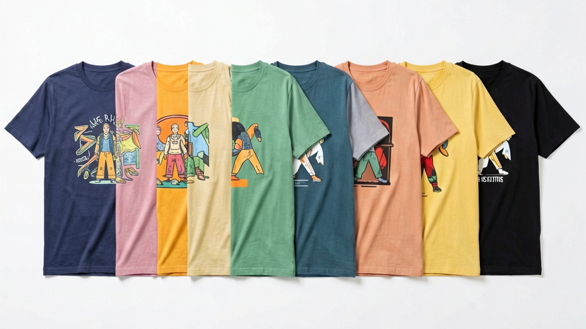
How Do You Choose a Graphic Tee Design That Actually Matches Your Style?
The fastest way to choose a graphic tee design that actually matches your style is to filter by five things in order: art style, motif, color palette, print scale that flatters your frame, and...
Sylvie Vance
•
The fastest way to choose a graphic tee design that actually matches your style is to filter by five things in order: art style, motif, color palette, print scale that flatters your frame, and brand voice. Skip the brand story until step five — most "wrong" tees fail on color or scale long before they fail on meaning. Use this same filter on the product page, in your closet, and on the rack at a pop-up. If a tee clears all five filters, it earns a spot in your rotation.
Key Takeaways
Define your visual identity first — pick a dominant color family, two go-to motifs, and one mood word.
Match the tee to clothes you already wear — hold the product photo against three pieces in your closet before you click add to cart.
Scale the print to your frame — small chest prints for slim builds, oversized back prints for taller or broader torsos.
Read the fabric spec, not the marketing copy — 180–220 GSM cotton with discharge or DTG printing holds ink better than cheap plastisol.
Vet the brand's intent — independent streetwear labels with a stated design philosophy outlast fast-fashion drops by years.
Step 1: Define Your Visual Identity
Before you scroll another product grid, write down three things: a dominant color family, two motifs you keep coming back to, and one mood word. Sounds corny, but the customers who actually build a wearable wardrobe do this once and reference it forever. If your answers are "black, white, red," "skulls and Japanese type," and "cinematic" — you have already filtered 70% of the market out. The remaining 30% is where the right tees live.
Identity beats trend on longevity. A Y2K motocross tee might be everywhere in a given month, but if your mood word is "cinematic," it will look like a costume by next season. Anchor to motifs you have already worn for at least two years. The data point isn't whether the design is fresh — it's whether you will still want to wear it after the algorithm moves on.
Step 2: Match the Tee to Your Existing Wardrobe
Open your closet. Not your wishlist — your actual closet. Pull the three pieces you wear most often: probably jeans, a jacket, and a pair of sneakers. The graphic tee you buy has to slot into outfits built around those three pieces, not the other way around. If 80% of your bottoms are indigo or black denim, a hot pink tee with lavender accents will fight everything you own.
A practical test: most product pages let you zoom on a model shot. Mentally subtract the model's pants and shoes. Does the tee still work with yours? If not, pass. The strongest graphic tee collections from brands like Stüssy, Represent, and Stryxen Studio are built around four or five repeatable colorways for exactly this reason — buyers can mix them confidently.
Step 3: Pick a Print Scale That Flatters Your Frame
Print scale is the most-skipped filter and the reason most "great design, wrong fit" tees end up in a drawer. As a rule: slim and short builds should look for small chest prints or left-chest hits, because a full-front A2-size graphic swallows the torso and makes proportions look off. Taller or broader frames can carry oversized back prints and wraparound graphics that actually look intentional.
There is no universal "good size" — a 12-inch-wide chest print is small on a 6'2" frame and enormous on a 5'6" frame. Look at the model's height and weight in the product photos when the brand provides them. If the brand doesn't list a model spec, treat the photo as a sketch, not a guarantee, and plan on a tailored tee if the scale is borderline.
Step 4: Check Fabric Weight and Printing Technique
Two tees with identical artwork can look completely different after five washes. The variables are fabric weight (GSM) and print method. For a graphic tee that holds up, target 180–220 GSM cotton — heavy enough to drape cleanly, light enough to wear year-round. Anything under 160 GSM tends to go see-through on graphic prints, especially in dark colorways.
On print method, the durable options are discharge printing (ink replaces fabric dye, so the print becomes part of the shirt — soft hand-feel, no peeling) and direct-to-garment (DTG) (high-detail art, slightly thicker feel). Cheap plastisol screen prints crack and peel within a season, particularly around high-flex areas like the hem and cuffs. If the product page doesn't mention the print method, that's a soft red flag — premium streetwear brands will brag about it.
Step 5: Vet the Brand's Story and Design Intent
By step five you've filtered out 90% of the market. Now ask the question most buyers ask first: does the brand have a point of view? Independent streetwear labels with a stated design philosophy — what they make, what they refuse to make, and why — produce tees that age into staples. Drops from brands without an underlying thesis tend to date within a season, no matter how good the photography is.
A few signals worth checking: do they explain the design intent on the product page, or just the materials? Do their previous collections hold a consistent visual language? Is the founder or design lead named publicly? Stryxen Studio, for example, builds around a specific graphic-design vocabulary — the same motifs recur across drops in new colorways rather than chasing unrelated trends. That kind of consistency is what separates a collection from a catalog.
Why Filter Beats Taste Every Time
Taste is what you reach for instinctively; filtering is what you decide after applying structure. Both matter, but most buyers rely on taste alone and end up with a closet full of impulse buys. The five-step filter exists because taste alone is unreliable — it's shaped by mood, by what you just scrolled past, by the lighting in the product photo. The filter removes those variables and asks the same questions every time.
Run the filter on your next five purchases and compare to the five purchases before. The filtered five should have a higher wear rate, fewer closet orphans, and a more coherent visual story. That's the test that matters — not whether each piece is perfect in isolation, but whether the rotation as a whole works. The filter optimizes for the rotation, not the individual decision.
The filter also makes buying faster. Once you've defined your visual identity (step 1), you can skip the first three filters for most purchases because the answers are already set. You move directly to print scale (step 3), fabric and print specification (step 4), and brand vetting (step 5). That shortened flow is what separates buyers who buy well from buyers who just buy often.
For buyers who feel overwhelmed by the volume of drops and the speed of trend cycles, the filter is a defense. It lets you say no quickly, confidently, and without guilt. The tees that pass the filter become your rotation; the tees that don't become someone else's purchase decision. The discipline is what turns a closet from a collection of accidents into a deliberate system.
The Bottom Line
Choosing a graphic tee that actually matches your style isn't about finding the best-looking design on any given day — it's about filtering with a system that removes personal bias and trend-chasing. Define your identity, match your existing wardrobe, scale the print, check the spec, and only then ask about the brand. Run that filter on every product page, and your closet will start to look deliberate instead of accumulated. If you want a starting point built around the exact principles in this guide — consistent motifs, durable print methods, and a small fixed palette — explore the Stryxen Studio collection and see how the five filters apply to a real drop.
Frequently Asked Questions
How do I know if a graphic tee design actually matches my style?
Run it through the five-step filter in order: art style, motif, color palette, print scale, and brand voice. If a tee clears all five and you can picture wearing it with three pieces already in your closet, it matches. If it fails on color or scale, no amount of brand story will save it.
What graphic tee prints last the longest without cracking?
Discharge printing and direct-to-garment (DTG) are the most durable methods. Discharge ink replaces the fabric dye so the print becomes part of the shirt and won't peel. Cheap plastisol screen prints are the usual cracking culprit, especially around the hem and cuffs.
Should graphic tees be tight or loose fitting?
It depends on print scale and your frame. Small chest prints work on slimmer fits; oversized back prints need a more relaxed cut to read correctly. A good rule is to match tee silhouette to print size — bigger print, more room; smaller print, more tailored.
How do I build a graphic tee collection that doesn't look repetitive?
Pick a fixed color palette (three to five tones) and a fixed motif family, then vary the print scale, placement, and base tee color across drops. That gives you variety in outfits while keeping a recognizable visual identity. Brands like Stryxen Studio design around this principle — different graphics, same vocabulary.
How Do You Choose a Graphic Tee Design That Actually Matches Your Styl | Stryxen Studio Blog

 Sylvie Vance