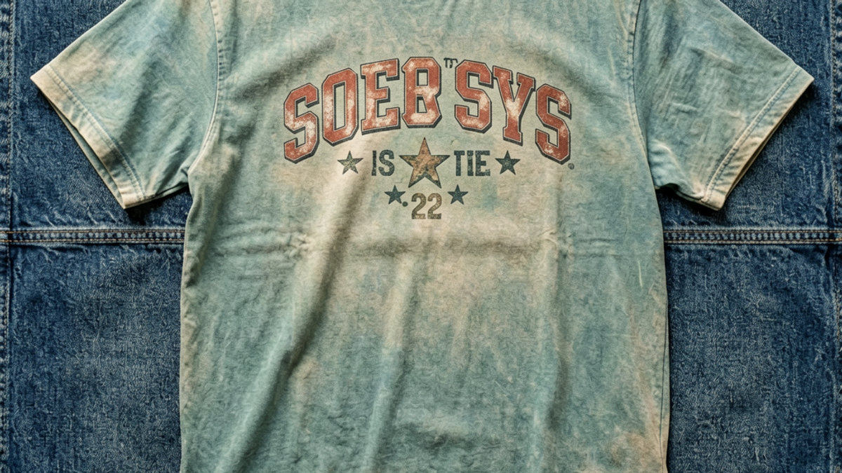
What Is a Retro Vintage Graphic Tee and Why Does It Never Go Out of Style?
A retro vintage graphic tee is a modern T-shirt engineered to look like a lived-in piece from a previous decade — typically featuring a faded or distressed print, a washed-down color palette, and...
Sylvie Vance
•
A retro vintage graphic tee is a modern T-shirt engineered to look like a lived-in piece from a previous decade — typically featuring a faded or distressed print, a washed-down color palette, and motifs pulled from 70s, 80s, 90s, or Y2K visual culture. The garment itself is new; the *aesthetic* is borrowed. The look is the point, not the actual age of the cotton.
Genuine Vintage vs. Retro Reproduction: What's the Difference?
Genuine vintage tees are originals — usually 15 to 40 years old, sourced from thrift stores, estate sales, or curated resellers. They have a softness, drape, and ink cracking that no new factory can fully replicate. The single-stitch hems, slubby cotton, and slightly off-register prints are the tells. They run small by modern standards, and prints often feel raised or nearly vanished from decades of wear.
Retro reproduction tees — sometimes called "vintage-inspired" or simply "retro" — are newly manufactured garments designed to mimic that worn-in look. Brands achieve it through garment dye, mineral wash, enzyme baths, and deliberately faded inks. The result is a tee that *reads* as old without the headaches of buying used: consistent sizing, intact graphics, and a price tag that doesn't require a deep dive into eBay listings.
For everyday wear, retro reproduction wins on practicality. For collectors, the hunt is half the fun. The Stryxen Studio collection sits firmly in the reproduction lane — built to look like you've had it for a decade, even on day one.
Design Motifs That Read Instantly as 'Retro'
A print doesn't need a date stamp to feel vintage. Three motif families do most of the heavy lifting: 1990s sportswear, Y2K maximalism, and 80s athletic heritage. Each carries a recognizable shorthand that triggers the look even before the fabric wash kicks in.
90s sportswear is the most influential retro vocabulary right now. Think varsity block lettering, arched team-style scripts, faded collegiate crests, and the washed pastel palette of 1992 track jackets. NBA and MLB throwback logos do the same work without the licensing headache — a generic arched script over a city name reads as "vintage" almost instantly.
Y2K maximalism is louder: chrome metallic ink, oversized type stacked in unexpected places, butterflies, flames, cracked-ice textures, and that specific late-90s gradient from cyan to magenta. The motif only works when the print itself is distressed — a crisp Y2K graphic on bright white cotton looks more 2014 Tumblr than 1999.
80s athletic heritage leans into three-stripe and trefoil-style geometry, racing numbers, simple sans-serif wordmarks, and washed primary colors — red, navy, off-white. The cuts are usually roomier, the prints smaller, and the overall feel closer to a training tee than a concert shirt. When in doubt, a single small chest graphic in a faded ink beats a full-back photo print.
Fabric and Finishing: How the 'Vintage' Look Is Actually Made
The print gets the credit, but the *fabric finish* is what sells the illusion. Three techniques are responsible for almost every retro tee you've ever thought was old: garment dye, mineral wash, and enzyme wash. Each changes the cotton itself, not just the ink on top.
Garment dye means the finished, sewn T-shirt is dipped in dye after construction — not the yarn before. That's why garment-dyed tees have slightly uneven color at the seams, hems, and collar where the dye pools differently. The result is a soft, broken-in look that pre-dyed fabric can't match. The downsides: it can stain lighter layers underneath for the first few washes, and sizing varies more than standard reactive-dyed cotton.
Mineral wash uses pumice stones or chemical abrasives to physically thin the surface fibers and knock back color saturation. The signature look is concentrated fading around high-friction zones — collar, cuffs, hem — with a softer, almost powdery hand feel. A genuine mineral-washed tee feels noticeably thinner than a standard 6oz cotton tee, which is part of why the vintage effect reads so convincingly.
Enzyme wash (also called bio-polish) uses cellulase enzymes to break down loose surface fibers. It softens the hand without the same level of color stripping as mineral wash, which makes it a better base for printed tees where you want the graphic to still pop. Most quality retro tees use enzyme wash as a first step and then a targeted mineral or bleach-splash on specific areas for the worn-in highlight effect.
Print technique matters just as much. Plastisol inks sit on top of the fabric and crack over time — vintage tees look vintage partly because the ink has cracked. Modern brands replicate this with thinner plastisol, discharge ink (which bleaches the dye out instead of adding color on top), or water-based inks that soak into the cotton and fade with it. The last option feels the most authentic but costs the brand more and rarely survives a hot dryer.
Three Outfit Formulas That Make a Retro Tee Look Intentional
The fastest way for a retro tee to look costume-y is to overthink the fit. Three reliable pairings cover most situations: a clean denim base, a layered outerwear look, and an elevated streetwear silhouette. Pick the one that matches where you're actually going.
Formula 1: Washed tee + straight-leg denim + sneakers
The default, and the hardest to get wrong. Pair the retro tee with a straight or relaxed straight-leg denim in a mid-wash, a plain white or off-white sneaker, and a simple belt. No jacket, no layering, no logo. The graphic does the work. This is the Stryxen Studio collection's intended fit baseline — the tees are cut to sit clean across the chest and hit around the hip, so they tuck into high-rise denim or hang untucked over a mid-rise without bunching.
Formula 2: Retro tee + open overshirt + cargo or work pant
Layer the tee under an unbuttoned cotton overshirt, flannel, or chore jacket. The retro graphic peeks through the open front, which keeps the print from being the *only* thing happening visually. Pair with a straight work pant or a relaxed cargo — anything with utility pockets and a heavier fabric weight plays nicely with the softness of a washed tee. Boots beat sneakers here if you want the look to skew 90s workwear rather than skater.
Formula 3: Retro tee + matching tonal set
The most modern read. Pair the tee with a tonal trouser or short in a complementary faded tone — think washed olive tee over stone canvas, or a faded brick tee over ecru cotton. The whole outfit feels like it came from one vintage bin. This formula only works when the colors are all in the same value range, so the graphic remains the visual focal point rather than competing with the trouser. Keep accessories minimal: one watch, one ring, one pair of clean white sneakers.
Key Takeaways
Retro vintage = new shirt, old aesthetic. The garment is freshly made; the print, color, and fabric are engineered to look lived-in.
Genuine vintage is rare, expensive, and inconsistently sized. Retro reproduction is what most people actually buy and wear day-to-day.
The vintage effect is mostly fabric finish (garment dye, mineral wash, enzyme wash) plus a distressed print (discharge ink or thinned plastisol), not just the graphic design.
Three motif families carry the look: 90s sportswear, Y2K maximalism, and 80s athletic heritage — each with its own color, scale, and print logic.
Let the tee be the outfit. Straight denim, an open overshirt, or a tonal set all work; aggressive layering or loud accessories break the spell.
Bottom Line
A retro vintage graphic tee isn't a costume or a passing trend — it's a specific set of design choices (motif, palette, print technique, fabric finish) applied to a new garment. Once you know what to look for, you can spot the difference between a tee that *happens* to be old and one that was built to look that way. Most of what's in rotation in 2026 is the latter, and it's a better buy: predictable sizing, intact graphics, and a wash that doesn't fall apart after three laundry cycles.
If you're building a rotation around the look, the Stryxen Studio collection is built on the reproduction principles above — garment-dyed mid-weight cotton, discharge and water-based inks, and prints drawn from the same 80s and 90s vocabulary that made the originals. Pick one tee that leans 90s sports, one that leans 80s athletic, and one Y2K piece for when you want the graphic to do the talking. The styling formulas above will carry all three.
Frequently Asked Questions
What makes a t-shirt look retro vintage?
Three things working together: a faded or distressed print, a washed-down color palette, and design motifs borrowed from the 70s through early 2000s. The fabric finish is usually the biggest tell — garment dye, mineral wash, or enzyme wash softens the cotton and knocks back the color in a way brand-new fabric never looks. A crisp, full-saturation print on bright white cotton will not read as vintage no matter what the graphic says.
How can you tell if a vintage tee is real or a reproduction?
Real vintage tees have single-stitch hems, slubby or irregular cotton, and ink that has either cracked or nearly faded out. The seams are usually a different color than the body, and the fit tends to run small by modern standards. Reproductions mimic the *look* — distressed ink, soft hand, uneven dye — but the cotton is uniform, the hems are double-stitched, and the print is intact. A reproduction is not a fake; it's a new shirt built to look old, and for most wearers that is the better buy.
Are graphic tees with a vintage wash still in style in 2026?
Yes — the washed, faded, retro-repro graphic tee has been the dominant streetwear silhouette for several seasons running and shows no sign of slowing down in 2026. The current version leans more 90s sportswear and 80s athletic heritage than the louder Y2K pieces that peaked in 2022-2023, but the underlying language — garment-dyed cotton, distressed prints, arched scripts — is still the default for everyday streetwear.
How should a retro graphic tee fit?
It should sit clean across the chest with no pulling at the neckline, hit around the hip bone when untucked, and have sleeves that end roughly mid-bicep. A slightly relaxed cut reads more authentic than a slim or muscle fit, because the original vintage tees being referenced were not cut close to the body. The neckline should look slightly open after a wash but not stretched, and the hem should fall straight, not flare.
Free Shipping on All OrdersFree ReturnsNo Hidden Fees
 Sylvie Vance