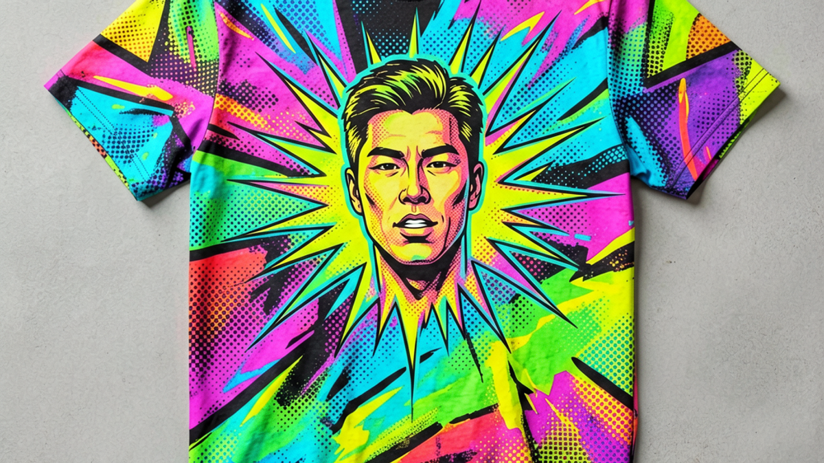
What Is a Pop Art Graphic Tee and How Did It Become a Streetwear Icon?
A pop art graphic tee is a T-shirt printed with imagery rooted in 1960s pop art — comic-book panels, halftone dots, neon-saturated faces and satirical consumer imagery — turned into wearable...
Sylvie Vance
•
A pop art graphic tee is a T-shirt printed with imagery rooted in 1960s pop art — comic-book panels, halftone dots, neon-saturated faces and satirical consumer imagery — turned into wearable streetwear. It borrows the visual language of Andy Warhol, Roy Lichtenstein and the underground comix scene, then drops it onto heavyweight cotton. The form has cycled in and out of streetwear since the late 1970s, but its core ingredients — bold outlines, primary colors, and graphic irony — have never actually left.
What Defines a Pop Art Graphic Tee?
A pop art graphic tee is not the same as a "colorful" or "vintage" tee. Three things separate the category. First, the imagery is appropriated or referenced from a recognizable pop-culture or consumer-culture source — a comic panel, a soup can, a celebrity portrait, a brand logo taken out of context. Original illustration is fine, but the visual grammar (flat color, hard edges, ironic distance) is borrowed. Second, the color palette is saturated and high-contrast: primary reds, electric yellows, comic-book blues, fluorescent pinks. Muddy or tonal palettes belong to other genres. Third, the print dominates the shirt. Pop art tees are not about subtle texture — they are a graphic on a chest, designed to be read from across a room.
What Is a Pop Art Graphic Tee and How Did It Become a Streetwear Icon? | Stryxen Studio Blog
The term "pop art" itself comes from the mid-1950s, when critics used it to describe work that rejected abstract expressionism's seriousness in favor of mass-media imagery. By the time the art movement hit the mainstream in the 1960s, it had produced two visual languages that streetwear has been quoting ever since: the Warholian serial portrait (repeated, color-shifted, deadpan) and the Lichtenstein comic-panel (Ben-Day dots, thick outlines, melodramatic captions).
From Warhol and Lichtenstein to the Runway
The translation from gallery to garment happened almost in real time. Warhol and his collaborators started making T-shirts in the late 1960s as a way to extend his art into everyday life — the same impulse as his Brillo boxes and fashion magazines. By the 1970s, the punk and new wave scenes had picked up the aesthetic and run with it: torn, safety-pinned shirts with deliberately crude screen prints of band logos and tabloid fragments.
The 1980s brought the first true streetwear appropriation. Stussy, founded in 1980, and labels that followed used pop-art visual cues — hand-drawn lettering, screen-printed iconography, ironic quotation of brand language — to build a new kind of casualwear that was neither high fashion nor mall basics. By the early 2000s, designers like Stephen Sprouse and Jeremy Scott had pushed the vocabulary onto the runway, pairing Lichtenstein dots with couture tailoring and making the comic-book shirt a legitimate high-fashion object.
Signature Design Elements
If you want to identify a pop art graphic tee at a glance, look for these four design moves. They are the visual vocabulary that runs from the original 1960s artworks through every streetwear reinterpretation since.
Halftone dots (Ben-Day process) — the small, evenly spaced dots that comic books used to fake shading. Most recognizable from Lichtenstein's romance-panel paintings.
Hard outlines — one- to three-pixel black borders around figures and shapes. No gradients, no airbrushing, no soft edges. The image reads like a printed page, not a painting.
Saturated primary palette — bold reds, yellows, blues, and (since the 1980s) neon magenta and cyan. Black and white panels are also common as a contrast device.
Speech bubbles and captions — short, deadpan, ironic text. Often a single word ("POW!", "YUM!", "NO!") in a hand-drawn or condensed display font.
Contemporary pop art tees mix these four elements in different ratios. A Warhol-referencing shirt leans on the serial portrait and tight color grid. A Lichtenstein homage leans on the dot pattern and comic caption. Newer pop art shirts borrow from anime, meme culture, and product packaging, but the visual grammar — flat color, hard edge, ironic distance — is the same.
Why Pop Art Graphics Keep Returning in Drops
Pop art is the most recycled visual vocabulary in streetwear, and the reason is structural. Pop art was originally designed to be reproducible. Warhol explicitly wanted his work to be silkscreened, mass-produced, and worn — he saw the silk-screen process as democratic, not a compromise. A pop art graphic tee is, in a sense, the form returning to its intended medium.
There is also a cyclical economic driver. Pop art's visual language is associated with the post-war consumer boom — the era of television, the supermarket, the comic-book stand. Every time streetwear wants to riff on consumer culture, recession-era nostalgia, or "vintage Americana" mood, the pop art vocabulary is the closest off-the-shelf aesthetic. It signals irony without having to draw anything new.
Finally, pop art tees photograph well. The high-contrast palette and graphic shapes read clearly on a flat-lay, on a model shot, and on a 200x200 thumbnail in a product grid. For a streetwear brand running a drop calendar, that practical advantage alone justifies keeping the visual language in rotation.
How to Style a Pop Art Tee Without Looking Costumey
The easiest way to make a pop art graphic tee look bad is to overload the rest of the outfit with the same energy. A bright graphic tee, neon sneakers, a patterned bucket hat, and a printed overshirt are four loud items in one fit. The shirt stops being a focal point and becomes part of a costume. The fix is to let the graphic tee carry the visual weight and keep everything else neutral.
Concretely: pair a pop art tee with plain black or off-white wide-leg trousers, low-profile sneakers, and a solid-color overshirt or chore coat in a muted tone when the weather needs it. Avoid stacking multiple graphic tees, avoid matching the tee's primary color to your pants or shoes (it makes the outfit look pre-planned rather than worn), and avoid "costume" accessories like novelty socks, character hats, or themed bags. The pop art shirt is the loud item; the rest of the fit is the frame.
The one exception is when the rest of the fit is fully monochrome. An all-black fit with a single pop art graphic tee reads as intentional, not busy. The eye goes to the print, and the silhouette stays clean.
Key Takeaways
A pop art graphic tee borrows 1960s pop-art visual grammar — flat color, hard outlines, ironic mass-media imagery — and prints it on heavyweight cotton.
Warhol and Lichtenstein are the two reference points: serial portrait vs. comic panel. Most pop art tees lean one way or the other.
The four signature elements are halftone dots, hard outlines, saturated primary colors, and speech-bubble captions. Spot all four and you have a textbook pop art shirt.
The aesthetic recycles because the form was designed to be reproduced — and because high-contrast graphics photograph well in product grids.
Style it neutral: plain trousers, low-profile sneakers, no other loud items. The tee is the focal point, not the costume.
Pop art graphic tees work because they are loud without being precious. The Stryxen Studio collection leans into that exact tension — bold, graphic, ironic, and built to be worn with a plain pair of cargos, not a matching set. Pick one up, treat the rest of the fit as a frame, and let the print do the talking.
Frequently Asked Questions
what is a pop art graphic tee
A pop art graphic tee is a T-shirt printed with imagery drawn from 1960s pop art — comic-book panels, halftone dots, neon-saturated faces, ironic consumer imagery. The visual grammar comes from artists like Andy Warhol and Roy Lichtenstein: flat color, hard outlines, saturated primary palette, and graphic deadpan. The print dominates the shirt, designed to be read from across a room.
who started the pop art t-shirt trend
Andy Warhol and his Factory collaborators began silkscreening T-shirts in the late 1960s, treating the garment as an extension of his art. Punk and new wave picked up the aesthetic in the late 1970s, and by the 1980s Stussy and other early streetwear labels had codified the pop art tee as a casualwear staple. Modern runway versions trace back to designers like Stephen Sprouse and Jeremy Scott in the 2000s.
how do you style a pop art shirt
Keep the rest of the fit neutral. Pair a pop art graphic tee with plain wide-leg trousers, low-profile sneakers, and a solid-color overshirt if the weather needs it. Avoid stacking multiple loud items, avoid matching the tee's primary color to your pants or shoes, and skip costume accessories. An all-black fit with one pop art graphic is the cleanest version — the shirt becomes the focal point.
what makes a graphic tee pop art vs vintage
Pop art tees use flat color, hard outlines, halftone dots, and ironic mass-media imagery borrowed from 1960s pop art. Vintage tees typically use washed, tonal palettes, distressed textures, and hand-drawn or embroidered graphics. If the print is high-contrast, saturated, and references comic-book or consumer-culture imagery, it is pop art. If the print is faded, tonal, and references a specific decade's band or brand, it is vintage.
 Sylvie Vance