Palace Put Betty Boop on Autumn 2026 Tees — Why 1930s Cartoons Work
Palace's Autumn 2026 collection started rolling out globally on August 7, and the graphic everyone stopped on was not a skate logo — it was Betty Boop, a Fleischer Studios character who first...
Sylvie Vance
•
Palace's Autumn 2026 collection started rolling out globally on August 7, and the graphic everyone stopped on was not a skate logo — it was Betty Boop, a Fleischer Studios character who first appeared in 1930. The reason a 95-year-old cartoon looks current on a 2026 skate tee is technical, not nostalgic: rubber-hose animation was drawn with heavy closed outlines and flat fills, which is exactly what survives screen printing, washing and shrinking. Old cartoons print better than new ones.
What Palace actually put in the Autumn 2026 collection
Palace revealed the lookbook on July 31 and followed it with the full item list on August 3, with the collection reaching shops and the webstore on August 7. The brand titles the season "Autumn 2026" rather than Fall, which is a small tell about where Palace still thinks it is from. It is a broad seasonal drop rather than a tight capsule, and it is doing several things at once.
An Avirex collaboration on leather outerwear — a heritage flight-jacket maker, borrowed for its badging and its sleeve-heavy design language.
Technical GORE-TEX shells, including camo, sitting in the same range as the leathers.
Collegiate pieces cut with Old English lettering, the varsity-by-way-of-hardcore look that has been creeping back for two seasons.
Fleischer Studios Betty Boop graphics — the licensing move that generated most of the coverage.
Read that list again and the Betty Boop tees are the odd item out. Avirex, GORE-TEX and Old English lettering are all versions of the same idea: borrow authority from workwear, military kit or institutions. A 1930s cartoon flapper borrows nothing of the sort. That is precisely why it works as the release's centrepiece — it is the only graphic in the collection that is not trying to look tough.
Why a 1930s cartoon reads as streetwear and a 1990s one often doesn't
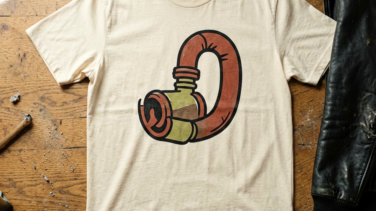
Betty Boop comes from the rubber-hose era of animation, the style that predates the model sheets and consistent proportions Disney standardised later. Rubber-hose characters were drawn with limbs like flexible tubing, no visible joints, heavy uniform black outlines and flat areas of a very small number of colours. Animators worked that way because it was fast to redraw thousands of times and because early film stock could not resolve fine detail. Every constraint they were working around is also a constraint of printing on cotton.
A screen print lays down opaque ink through a mesh. Thin lines fill in, gradients band, and small internal detail closes up after a few washes. Rubber-hose art has no thin lines, no gradients and almost no internal detail. It was, accidentally, designed for exactly this reproduction problem eighty years before the graphic tee industry existed. Put a modern render with soft shading and a dozen blend modes on the same shirt and it will look muddy at arm's length and worse after a summer.
There is a second, less obvious advantage. Because the outline carries the whole drawing, rubber-hose art stays legible when it is scaled up to a full chest print or blown out across a back panel. Most contemporary character art has a scale it was designed for and falls apart outside it.
What licensing a pre-war character actually signals
Skate brands have been licensing cartoons for decades, but the choice of which cartoon has become the message. Recent seasons across the industry have leaned on the same recognisable properties, which means the graphic tells you very little beyond the fact that a licensing deal happened. Reaching back to Fleischer Studios is a different bet: a large portion of the audience knows the character silhouette without having seen a single one of the shorts.
That gap is the point. The graphic works as pure design language rather than as a fandom signal, so it does not sort the wearer into a franchise. You can wear it without it being a statement about what you watch — which is, for most people most of the time, the entire practical appeal of a character tee over a band tee.
How to wear a vintage cartoon tee without it wearing you
The failure mode with cartoon graphics is looking like you are dressed as a child, and it is almost always a proportion problem rather than a graphic problem. A few rules hold up.
Let the tee be the only playful thing. Cartoon graphic plus loud trousers plus statement sneakers reads as costume; cartoon graphic plus straight dark denim plus a plain low-top reads as considered.
Go up in fabric weight, not down. A rubber-hose print on a thin, soft-hand tee looks like sleepwear. On a mid-to-heavy cotton with a structured shoulder it looks like a skate shirt.
Use outerwear to crop the graphic. An open overshirt or chore coat cutting through the print's vertical edges kills most of the childish read instantly.
Mind the colour count. If the print uses three colours, keep the rest of the outfit inside two. Cartoon prints are already high-contrast; competing with them is what tips the look.
The Autumn 2026 range makes this easy in a way that is worth stealing even if you never buy the Palace piece. The same collection that carries the cartoon graphics also carries leather and GORE-TEX outerwear. Pairing a genuinely silly graphic with a genuinely serious jacket is the oldest balancing trick in skatewear, and it is the entire reason this drop hangs together.
Where cartoon-character tees go wrong
Three things separate a licensed cartoon tee that lasts from one that gets retired after two wears, and none of them are the character.
The first is print placement. A chest print sized for a mannequin sits differently on a body; too high and it rides onto the collarbone, too low and it disappears into the waistband when you sit. The second is ink hand — how much the print stiffens the fabric. Heavy plastisol on a flat cartoon fill covers a lot of surface area, so a cheap print becomes a plastic panel that cracks along fold lines. Look for prints that have been laid down thin enough to move with the cotton.
The third is the licence itself, and it is the one nobody checks. Officially licensed character graphics are drawn from the rights holder's approved artwork, which means correct proportions and correct line weights. Unlicensed reproductions are typically traced or upscaled from low-resolution images, and the tell is always the outline: it will be slightly uneven in thickness, or it will have soft edges where a clean vector would be sharp. On rubber-hose art, where the outline is the drawing, that is the difference between the shirt looking designed and looking bootlegged.
The Bottom Line
Palace putting Fleischer Studios artwork on its Autumn 2026 tees is a good reminder that the oldest graphics are often the most printable ones. Heavy closed outlines, flat fills and a small colour count are not a retro aesthetic choice — they are the specification that survives screen printing and thirty washes. Whether or not you buy this collection when it hits, use the same test on any character tee: look at the outline, count the colours, and check whether the drawing would still read from across a room.
Frequently Asked Questions
When did the Palace Autumn 2026 collection release?
Palace revealed the Autumn 2026 lookbook on July 31, 2026 and published the full item list on August 3, with the collection rolling out globally from August 7, 2026. Palace typically releases in weekly drops through its webstore and physical stores, so individual pieces from a season can appear across several release dates rather than all at once.
Why is Betty Boop on a skate brand's collection?
Betty Boop is a Fleischer Studios character who debuted in 1930, and the graphics appear under licence. Beyond the novelty, the art style is a practical fit: rubber-hose era animation used heavy black outlines and flat colour fills, which reproduce cleanly through screen printing and stay legible after repeated washing. It is also the only graphic in a collection full of leather, camo and collegiate lettering that is not trying to look tough, which gives the range its contrast.
How can you tell a licensed cartoon graphic tee from a bootleg?
Check the outline. Licensed graphics are printed from the rights holder's approved vector artwork, so line weight is consistent and edges are sharp. Bootlegs are usually traced or upscaled from low-resolution images, which produces outlines that vary in thickness or go slightly soft at the edges. Also look at the colour separations — a legitimate print will have clean boundaries between flat colour areas rather than fringing where two colours meet.
How do you style a cartoon graphic tee without looking childish?
Keep the tee as the only playful element and let everything else be plain: straight dark denim and a clean low-top sneaker is the safest base. Choose a mid-to-heavyweight cotton rather than a thin soft tee, since fabric weight does most of the work in making a cartoon print read as skatewear instead of sleepwear. Layering an open overshirt or chore coat over the print also breaks up its edges, which removes most of the costume effect.
Palace Put Betty Boop on Autumn 2026 Tees — Why 1930s Cartoons Work | Stryxen Studio Blog

 Sylvie Vance