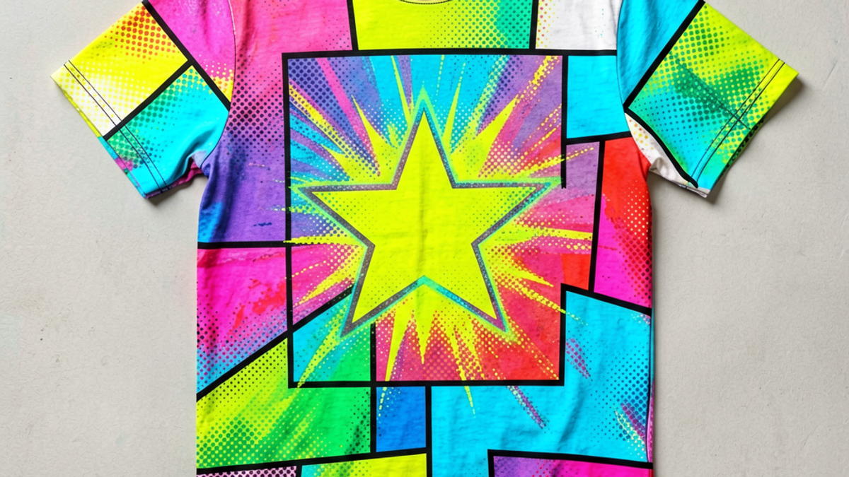
What Is a Pop Art Graphic Tee and How Did It Become a Streetwear Icon?
A pop art graphic tee is a t-shirt printed with imagery drawn from 1960s pop art — comic-book panels, halftone dots, neon color blocks, and satirical takes on celebrity, consumerism, and mass...
Sylvie Vance
•
A pop art graphic tee is a t-shirt printed with imagery drawn from 1960s pop art — comic-book panels, halftone dots, neon color blocks, and satirical takes on celebrity, consumerism, and mass media. Unlike a vintage band tee, the visual language comes from fine-art movements pioneered by Andy Warhol, Roy Lichtenstein, and Claes Oldenburg, then translated into wearable cotton. It's the rare graphic tee that reads as both fine-art reference and streetwear staple.
What Counts as a Pop Art Graphic Tee?
A pop art graphic tee borrows its visual grammar directly from the pop art movement that exploded in New York and London between 1958 and the late 1960s. The defining trait isn't a single motif — it's a visual vocabulary: primary-color floods, Ben-Day dots, comic-book speech bubbles, repeated iconography (soup cans, dollar signs, Marilyn's face), and a flat, screen-printed aesthetic that deliberately blurs the line between museum and mass production.
In practice, you'll recognize one by three signals. First, the imagery is high-contrast and graphic, not photorealistic — flat color planes win out over gradients. Second, the source material is — ad layouts, magazine clippings, comic strips, or celebrity faces pulled from the front page and re-framed as art. Third, the shirt treats the print as a rather than a logo or slogan, which is the line separating a pop art tee from your standard band merch.
ironic or commercial
deliberate aesthetic choice
What it is not: a vintage concert tee, a 90s cartoon-licensed character shirt, or a generic geometric-pattern tee. Those borrow from different visual traditions. A pop art graphic tee specifically channels the mid-century collision of commercial printing and fine art.
From Warhol and Lichtenstein to the Runway
The story starts in 1962, when Andy Warhol exhibited his Campbell's Soup Cans in a New York Ferus Gallery — 32 near-identical canvases that mimicked grocery-shelf printing so faithfully the art world couldn't decide if it was a prank or a manifesto. A year later, Roy Lichtenstein began painting enlarged comic-strip panels, complete with the Benday dots and hard outlines of cheap newsprint reproduction. Both artists were making the same bet: that commercial imagery, properly framed, was as legitimate as any oil painting in the Met.
That framing collapsed the wall between art and merchandise. Warhol's Factory studio screen-printed everything from Brillo boxes to Velvet Underground album covers, treating the t-shirt as a natural extension of the silkscreen. By the early 1970s, you could walk into a SoHo gallery and buy a Warhol-illustrated tee — essentially the first art-graphic tees in any modern sense.
The look went underground through punk and new wave in the late 70s — Malcolm McLaren and the Seditionaries shop in London lifted Lichtenstein-style comic panels and scrambled them with torn-punk typography. By the 80s, it was everywhere: Jean-Michel Basquiat wore custom-painted tees, and the downtown NYC club scene turned screen-printed graphic tees into the unofficial uniform of a generation. The 90s brought Stephen Sprouse and Maripol doing Warhol-style neon scrawl for Keith Haring's circle, and by the early 2000s Comme des Garçons, Moschino, and Jeremy Scott were quoting pop art panel-by-panel on the runway.
Today the lineage is straightforward: any streetwear brand releasing a halftone-print tee, a Marilyn-monochrome panel, or a comic-strip explosion graphic is working in a direct line back to that Ferus Gallery wall in 1962.
You can usually identify a pop art graphic tee in a rack by scanning for five visual signatures. None of them are required, but the more that show up, the more confidently the design is speaking the pop art language.
Halftone dots — the small, uniform dot pattern that cheap newsprint used to fake grayscale; Lichtenstein made it iconic by enlarging it until the dots themselves became the image.
Hard black outlines — comic-strip line work around figures and objects, often 2–4 pixels thick, with no soft shading inside.
Primary-color floods — flat areas of pure red, yellow, and blue, sometimes with secondary magenta and cyan, with no gradient transitions.
Onomatopoeia and word balloons — "POW!" "WHAM!" "BAM!" floating in jagged starbursts, or comic speech balloons with tongue-in-cheek text.
Repeated iconography — Marilyn's face, a soup can, a dollar sign, a banana, or a celebrity portrait repeated in a grid, usually in different colorways.
Beyond those, modern streetwear versions often add screen-print texture, deliberate misregistration (where the colors don't quite line up, mimicking cheap mass production), and oversized scale — a single comic panel covering the entire chest instead of a left-breast placement. The misregistration detail is a tell: the best pop art tees look slightly *imperfect* on purpose.
Why Pop Art Graphics Keep Coming Back in Drops
Three reasons, and they're not all aesthetic. First, pop art sells nostalgia without looking dated — the visual language is locked in 1962–1968, so it doesn't age the way 2010s typography or 2020s Y2K micro-graphics do. A halftone print bought today still looks like a deliberate reference, not a fashion cycle.
Second, it's legally safer than it used to be. The 2010 Supreme x Louis Vuitton collab, the Warhol Foundation's licensing program, and Lichtenstein estate collaborations have all normalized the visual language as fair game. Brands no longer need to rip off a specific painting — they can build in the style and sell the tee as homage, not counterfeit.
Third, the attention economy rewards loud graphics. A tee with a flat 4-color comic print reads clearly in a single Instagram thumbnail, a TikTok scroll, or a 6-foot group photo. Subtle doesn't get reposted. Pop art tees are an algorithmic fit, not just an aesthetic one.
How to Style a Pop Art Tee Without Looking Costumey
The most common mistake is treating the shirt as a costume piece — pairing a loud Warhol-style print with more loud prints, novelty accessories, and a colored hat. That reads as "trying," which is the opposite of the insouciant cool that made pop art tees a streetwear staple in the first place. The fix is contrast.
Anchor the print with plain, dark, structured basics: black wide-leg trousers, a straight-cut raw denim, or a charcoal pleated skirt. Keep footwear minimal — a clean white sneaker, a black Chelsea boot, or chunky soled shoes in a single tone. Outerwear should be quiet: a black trench, an oversized charcoal blazer, a plain leather jacket. Let the tee be the only piece in the outfit that's talking.
Two more moves that consistently work. Tuck the tee — a French tuck into high-waisted trousers breaks the costume silhouette and gives the print a frame. And commit to one print per outfit — don't combine a Lichtenstein-style shirt with a Warhol-style cap. Pick one reference, wear it loud, and let everything else be a neutral. The Stryxen Studio collection leans into this: graphic-heavy tees built to be styled with simple, dark staples that let the artwork do the work.
Key Takeaways
A pop art graphic tee borrows its visual grammar from 1960s pop art — halftones, flat color, comic panels, and ironic commercial imagery.
The lineage runs Warhol → Lichtenstein → Factory screen-prints → 70s punk → 80s club kids → 90s downtown NYC → modern streetwear.
Five visual signatures identify one: halftone dots, hard black outlines, primary-color floods, onomatopoeia, and repeated iconography.
The style keeps returning because it's nostalgia-proof, legally clearable, and reads strongly on social platforms.
Style it quiet: dark, plain staples, one print per outfit, a French tuck. Let the shirt be the only piece talking.
The Bottom Line
A pop art graphic tee is the rare piece of streetwear that's also a moving art-history seminar. Wearing one is a quiet flex if you know what you're looking at — the halftone dots, the deadpan reference to a 1962 grocery display, the screen-print misregistration that says "this was made on purpose to look cheap." Get the references, anchor the loud print with quiet staples, and the shirt does the rest. Browse the Stryxen Studio collection for graphic tees built on the same visual lineage — high-contrast prints designed to wear well with the basics you already own.
Frequently Asked Questions
what is a pop art graphic tee
A pop art graphic tee is a t-shirt printed with imagery drawn from the 1960s pop art movement — comic-book panels, halftone dots, flat primary-color fields, and ironic takes on consumer imagery. It borrows its visual language from artists like Andy Warhol and Roy Lichtenstein, then translates those fine-art references into wearable cotton. The key marker is graphic impact: high contrast, flat color, and obvious art-world reference, not photorealism or vintage band artwork.
is a pop art shirt the same as a vintage band tee
No. A pop art shirt references fine-art movements and commercial-printing aesthetics from the 1960s, while a vintage band tee is tied to a specific music act and tour. Visually, pop art tees lean on halftone dots, hard comic outlines, and flat color fields; band tees usually feature a tour date, band logo, or photo. They sit in different design traditions even when worn the same way.
how do you style a pop art t-shirt so it does not look like a costume
Anchor the loud print with quiet basics. Pair the tee with black wide-leg trousers, straight raw denim, or a charcoal pleated skirt, then add clean white sneakers, black boots, or a plain leather jacket on top. Do a French tuck to break the silhouette, and keep the rest of the outfit to one print max. The Stryxen Studio collection is built around this approach: graphic-heavy tees that work with the simple staples you already own.
why do pop art graphics keep coming back in streetwear
Three reasons. The visual language is locked in a 1960s time window, so it doesn't look dated the way trend-cycle graphics do. Licensing has become clearer through programs like the Warhol Foundation and Lichtenstein estate collaborations, so brands can build in the style without legal risk. And flat, high-contrast prints read strongly on social platforms — they survive a thumbnail, a scroll, and a group photo, which is where most streetwear gets discovered today.
Free Shipping on All OrdersFree ReturnsNo Hidden Fees
 Sylvie Vance