What Is a Pop Art Graphic Tee and How Did It Become a Streetwear Icon?
A pop art graphic tee is a t-shirt printed with imagery drawn from the 1960s pop art movement — comic panels, halftone dots, neon colors, screen-printed icons, and satirical takes on consumer...
Sylvie Vance
•
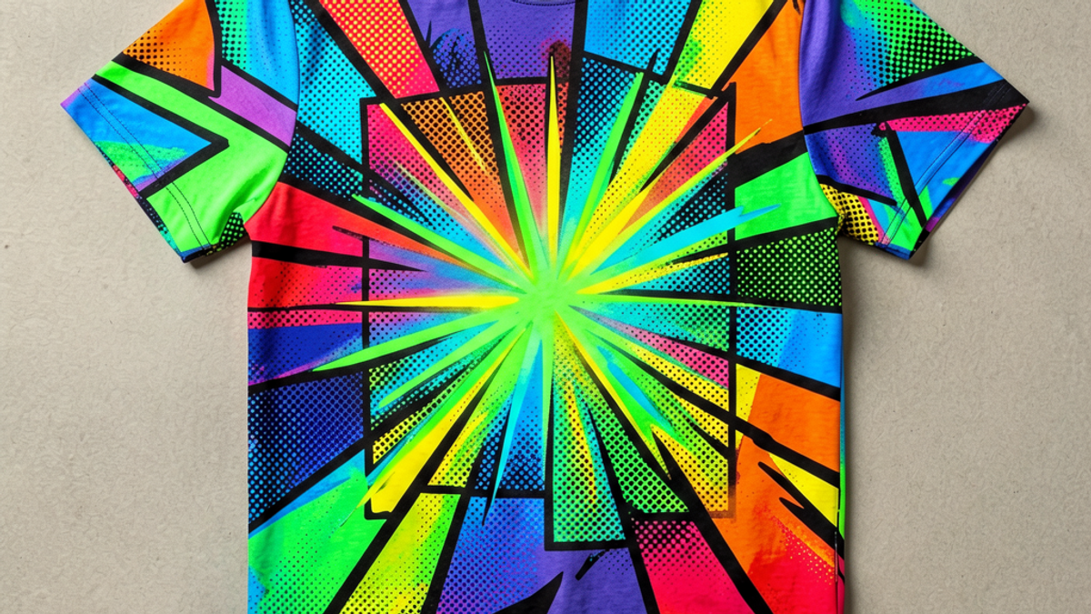
A pop art graphic tee is a t-shirt printed with imagery drawn from the 1960s pop art movement — comic panels, halftone dots, neon colors, screen-printed icons, and satirical takes on consumer culture. It borrows the visual language of Andy Warhol and Roy Lichtenstein and turns it into wearable streetwear, which is why the pop art tee keeps cycling back into capsule drops and mainline collections decade after decade.
What a Pop Art Graphic Tee Actually Is
At its core, a pop art graphic tee is any t-shirt whose print borrows the visual vocabulary of the pop art movement that exploded out of New York and London in the late 1950s and 1960s. That vocabulary is unmistakable: Ben-Day dots, thick black outlines, primary red and electric yellow, single-blast neon palettes, and imagery lifted from advertising, comic books, and celebrity photography. When those elements end up printed on cotton, the shirt stops being a blank canvas and becomes a moving poster.
The genre isn't limited to museum reproductions. Most pop art tees are original artwork designed to read like pop art at a glance — bold type, a comic-panel split, a halftone background, or a saturated single-subject illustration. The shirt's job is to shout from across a room the way a Warhol Marilyn or a Lichtenstein DIAL M FOR MURDER panel shouted from a gallery wall.
From Warhol and Lichtenstein to the Runway
Pop art started as a reaction against the seriousness of abstract expressionism. Andy Warhol turned Campbell's soup cans and Marilyn Monroe into silkscreen icons. Roy Lichtenstein blew up comic-book panels — fighter planes, lovers' spats, drowning girls — into oil paintings the size of murals. By the late 1960s the imagery had already escaped the gallery: it was on posters, on the cover of Interview magazine, and on the first wave of screen-printed concert and band tees.
Fashion caught up in waves. In the 1980s, designers like Stephen Sprouse and Jean-Charles de Castelbajac pushed graffiti and pop imagery directly onto garments. In the 1990s, streetwear brands began licensing and reworking the same visual cues on heavyweight cotton. The 2010s brought a high-fashion revival — luxury houses collaborating with pop art estates, and ready-to-wear runway looks built around a single graphic print. Every decade since has re-skinned the same DNA for a new audience.
Signature Design Elements That Read as Pop Art
Halftones, panels, and the comic-book grid
Three design elements signal pop art on a tee more than anything else. First, halftone dots — the same dotted gradient Lichtenstein borrowed from cheap newsprint printing, used to fake shading and give flat artwork texture. Second, comic-panel layouts, where a single print is split into 2 to 6 frames, each one a different pose or colorway. Third, oversized sans-serif type, often dropped at a slight angle, shouting a single word: BOOM, POW, SALE, YUM.
Color: neon, primary, and unapologetic saturation
Pop art on a tee is rarely subtle. The palette is built from saturated primaries — cadmium red, lemon yellow, cobalt blue — punched up with one or two neon accents. High contrast is the point. A muted pop art tee usually means the design failed. The genre is loud on purpose; it wants the shirt to act like a billboard for whoever's wearing it.
Iconography: lips, eyes, soup cans, speed lines
The icon set is small and instantly recognizable. Lips. A single oversized eye. A soup can. A speech bubble. Comic-style speed lines behind a subject. A halftone portrait with a flat color block dropped over half the face. These tropes are public domain in spirit, which is why the best pop art tees feel familiar on the first glance rather than derivative.
Why Pop Art Graphics Keep Coming Back in Drops
Pop art works for drops because the source material is essentially unlimited and unowned. A brand doesn't need to license a Lichtenstein to print a halftone explosion; it just needs to commission original art in the same language. That means every drop can ship a fresh lineup of prints without the long lead times and royalty cycles that gate other graphic genres.
There's also a built-in nostalgia loop. The look is associated with a peak moment for graphic design — the moment when album covers, magazine spreads, and gallery shows were all reading the same visual script. That gives pop art tees a built-in sense of occasion that a clean logo tee can never quite match. Collectors know the reference, even when the print itself is brand new.
How to Style a Pop Art Tee Without Looking Costumey
Let the shirt be the loudest thing in the fit
A pop art graphic tee is doing 80% of the visual work, so the rest of the fit should get out of its way. Pair it with solid, unbranded basics — black or mid-wash denim, plain cargos, plain sneakers. Avoid layering a second graphic jacket or another loud print on top, which turns the look into a costume.
Fit matters more than you think
Boxy oversized pop art tees work with wide-leg jeans or carpenter pants. A trim or cropped pop art tee works with high-rise trousers and a clean sneaker. Tuck the tee or half-tuck it if the print is concentrated at the hem — this is the single easiest way to make a graphic tee look styled rather than thrown on.
Reading the room
Pop art tees are louder than most fashion pieces, so context matters. They're ideal for casual dinners, streetwear-leaning offices, concerts, gallery openings, and weekend wear. They're not the right call for traditional formal settings, conservative workplaces, or events where a muted palette is the unwritten dress code. When in doubt, look at the event flyer — if the type on the flyer is in Helvetica, leave the pop art tee at home.
Key Takeaways
A pop art graphic tee borrows the visual language of 1960s pop art — halftones, comic panels, neon color, and screen-printed iconography.
The genre traces a straight line from Warhol and Lichtenstein through 1980s designer graphics into modern streetwear drops.
The look is defined by halftone dots, panel layouts, oversized type, and a saturated primary-plus-neon palette.
Pop art prints work for drops because the source style is unowned and the nostalgia loop is permanent.
Style by keeping everything else in the outfit solid, simple, and unbranded — let the shirt be the loudest thing in the fit.
Frequently Asked Questions
what makes a t-shirt pop art
A t-shirt is pop art when its print borrows the visual language of the 1960s pop art movement — halftone dots, comic-book panels, thick black outlines, saturated primary colors, and imagery lifted from advertising or celebrity culture. The print should read like a poster from a Lichtenstein show or a Warhol screen test, not like a generic brand logo.
did andy warhol design t-shirts
Warhol didn't design t-shirts himself, but he designed the visual world they came from. His silkscreens of Marilyn Monroe, Campbell's soup cans, and celebrity portraits defined the iconography that later graphic-tee artists imitated. Once his imagery hit posters, magazines, and album covers in the late 1960s, it was a short step onto cotton.
are pop art tees still in style
Yes — pop art tees cycle in and out of fashion roughly every five to seven years, but the underlying style never really leaves. The current wave leans on halftone portraits, single-word comic type, and saturated neon palettes, often as part of capsule drops rather than mainline basics.
how to style a graphic tee for men
Pair a graphic tee with plain, unbranded basics — solid denim, simple trousers, or clean cargos. Tuck or half-tuck the shirt to define the waist, keep footwear low-key, and avoid stacking it with a second loud print. The tee is the statement; everything else should support it.
Pop art graphic tees have earned their spot as one of the most reprinted ideas in fashion because the source material is endlessly flexible and the result is instantly recognizable. The best versions feel like a poster you happen to be wearing, not a costume. Browse the Stryxen Studio collection for graphic tees built with the same principles — original artwork, heavyweight cotton, and prints that hold up in the wash.
Frequently Asked Questions
what makes a t-shirt pop art
A t-shirt is pop art when its print borrows the visual language of the 1960s pop art movement — halftone dots, comic-book panels, thick black outlines, saturated primary colors, and imagery lifted from advertising or celebrity culture. The print should read like a poster from a Lichtenstein show or a Warhol screen test, not like a generic brand logo.
did andy warhol design t-shirts
Warhol didn't design t-shirts himself, but he designed the visual world they came from. His silkscreens of Marilyn Monroe, Campbell's soup cans, and celebrity portraits defined the iconography that later graphic-tee artists imitated. Once his imagery hit posters, magazines, and album covers in the late 1960s, it was a short step onto cotton.
are pop art tees still in style
Yes — pop art tees cycle in and out of fashion roughly every five to seven years, but the underlying style never really leaves. The current wave leans on halftone portraits, single-word comic type, and saturated neon palettes, often as part of capsule drops rather than mainline basics.
how to style a graphic tee for men
Pair a graphic tee with plain, unbranded basics — solid denim, simple trousers, or clean cargos. Tuck or half-tuck the shirt to define the waist, keep footwear low-key, and avoid stacking it with a second loud print. The tee is the statement; everything else should support it.
What Is a Pop Art Graphic Tee and How Did It Become a Streetwear Icon? | Stryxen Studio Blog

 Sylvie Vance