Jeongyeon's Handwritten Goodbye Letter Is Why Typography Tees Are Trending
Jeongyeon spiked into US Google Trends on August 10 after the TWICE member confirmed she is leaving JYP Entertainment for VARO Entertainment — in a handwritten letter posted to fans rather than an...
Sylvie Vance
•
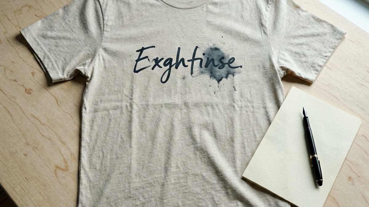
Jeongyeon spiked into US Google Trends on August 10 after the TWICE member confirmed she is leaving JYP Entertainment for VARO Entertainment — in a handwritten letter posted to fans rather than an agency press release. The fashion consequence is narrower and more useful than it sounds: handwriting typography tees — shirts whose entire graphic is a line of someone's actual penmanship, no illustration, no photo — are the print category quietly absorbing that attention. Here is what the trend is, and how to wear it without looking like staff.
What Jeongyeon actually announced
The news broke in the early hours of August 10 UTC and moved fast. Soompi, ZAPZEE and Koreaboo all reported within minutes of each other that Jeongyeon had personally confirmed her departure from JYP Entertainment, the agency that has managed her since TWICE's formation, and signed an exclusive contract with VARO Entertainment. ABS-CBN carried the detail that matters most to fans: she is leaving the agency, not the group. TWICE continues with all nine members.
Speculation had been building since late June, when Inquirer.net and others flagged an expiring contract. What made this week's confirmation a search event rather than a business story was the format. Instead of a corporate statement, Jeongyeon posted a handwritten letter — physically written, photographed, published. Koreaboo's headline led with the handwriting itself. Several outlets framed the move as a pivot toward acting, which VARO's roster supports, but the artefact that circulated was the page.
That distinction is the whole reason this shows up in a clothing blog. A contract signing produces no image. A handwritten letter produces one image that gets screenshotted, cropped, zoomed and reposted for seventy-two hours straight. Attention attaches to the visual form, and the visual form here is handwriting on a plain field.
Why a handwritten letter turns into a print trend
Graphic tees follow attention, but they cannot follow it directly. Nobody is licensing Jeongyeon's actual letter, and nobody should — printing a real person's private handwriting on merchandise is both legally messy and genuinely creepy. What spreads instead is the visual grammar: the idea that a shirt can carry a line of unmistakably human handwriting and nothing else.
This has happened before with predictable regularity. The pattern is that when an emotionally loaded document becomes the internet's image of the week, the print market responds within days with the format rather than the content. Concert setlists written on notebook paper, protest placards, handwritten liner notes and scrawled album annotations have all produced the same aftershock. The specific words fade in a fortnight. The typographic language stays in rotation for a season or two.
The commercial logic is also simple. Handwriting-based graphics are cheap to print well. They are usually a single colour, they carry no halftone, and they survive on garments that cannot handle a photographic print. A small studio can turn one around in a week. That speed is exactly why the format spikes ahead of anything licensed.
What a handwriting typography tee actually is
The category is more specific than 'a shirt with words on it.' A handwriting typography tee has four traits that separate it from the generic slogan tee you have seen in every airport gift shop since 2011.
The letterforms are genuinely irregular. Real handwriting has inconsistent baselines, uneven stroke weight and letters that lean at slightly different angles. A font that merely imitates script is instantly readable as fake at arm's length, which defeats the entire premise.
The print is a single ink. Black on ecru, oxblood on bone, navy on grey. Two-colour handwriting prints look like a corporate signature block, not a note. If the graphic needs a gradient, it is not this trend.
The composition is off-centre and asymmetric. Handwriting on a page is not centred, and a handwriting tee that is perfectly centred with even margins reads as a template. The best examples sit high on the chest, break the vertical axis, and let a line run long.
The text is short and non-declarative. A phrase, a date, a fragment of a sentence. Not a manifesto, not a brand slogan, not a joke with a punchline. The appeal is that it reads like something private you were allowed to see.
There is a related sub-format worth knowing: the annotated tee, where the handwriting appears as marginalia around a small block of printed type — crossed-out words, arrows, a correction. It is harder to execute and much harder to wear, but it is where the more interesting studios are working right now.
How to wear a text-only tee without looking like staff
The failure mode for any text-forward shirt is looking like a uniform. Event crew, volunteers and promotional giveaways all use text-only garments, so the styling job is to signal that the shirt was chosen rather than issued.
Never wear it as the only text in the outfit. No cap with a wordmark, no logo bag, no printed socks. Competing text is what makes an outfit read as sponsored.
Layer something structured over it. An unlined overshirt, a soft blazer or a work jacket left open frames the print and cuts the giveaway association immediately. The handwriting becomes a detail rather than a billboard.
Keep the fit deliberate. A boxy body with a shoulder seam that actually sits on your shoulder point reads as designed. A shirt one size too big with a dropped seam halfway down your arm reads as a leftover.
Match the ink to something small and far away. If the print is oxblood, put oxblood in the laces, the watch strap or the jacket lining — not the trousers. The echo should be findable, not obvious.
For anyone wearing this to an actual concert, the same logic applies with one addition: handwriting graphics photograph badly in coloured stage lighting, because low-contrast single-ink text disappears under red and magenta wash. If the photos matter to you, go higher-contrast than you would in daylight.
Where the handwriting trend goes wrong
Three ways, all of them common right now.
The first is printing someone else's real handwriting. Reproducing an identifiable person's penmanship without permission is a rights problem and a taste problem simultaneously, and the shirts that do it tend to appear on print-on-demand marketplaces within hours of any news event. They are easy to spot: the graphic is a screenshot, complete with compression artefacts and sometimes a cropped interface element still visible in the corner.
The second is the font substitution. A handwriting graphic set in a licensed script typeface has perfectly consistent letterforms, which is precisely the quality real handwriting lacks. At two metres it reads as a wedding invitation. If you look at a shirt and every lowercase 'e' is identical, it is a font.
The third is over-length. Handwriting tees fail when the text runs past about twelve words, because the graphic stops being an image and becomes something strangers have to stand close and read. That is uncomfortable for everyone. The good ones are legible in under two seconds.
One more practical note: single-ink handwriting prints are thin by nature, and thin prints crack faster than heavy block graphics if they are treated badly. Wash inside out, cold, and skip the dryer. A cracked photographic print looks vintage; a cracked handwriting print looks like a mistake, because missing strokes make letters unreadable.
The Bottom Line
Jeongyeon leaving JYP for VARO Entertainment while staying in TWICE is a career story, not a fashion one. But the way she announced it — a handwritten letter, published as an image, circulated for days — is the kind of visual event that reliably pushes a print format into rotation. Handwriting typography tees are that format: single ink, irregular letterforms, asymmetric placement, short text.
If you are buying into it, buy on execution rather than on subject. Check that the letterforms vary, that the print is one colour, that the text is short enough to read at a glance, and that nobody's private handwriting is being sold back to them. That is a shirt that outlives the news cycle that made it briefly interesting.
Frequently Asked Questions
Did Jeongyeon leave TWICE?
No. Jeongyeon confirmed on August 10, 2026 that she is leaving JYP Entertainment and signing with VARO Entertainment, but reporting from ABS-CBN and others is explicit that she remains a member of TWICE. The change is to her management agency, not to the group's lineup, and several outlets connected the move to acting work.
What is a handwriting typography graphic tee?
It is a tee whose entire graphic is a short line of genuine handwriting, printed in a single ink, with no illustration or photograph. The defining features are irregular letterforms, asymmetric off-centre placement, and text short enough to read in about two seconds. It is distinct from the generic slogan tee, which is usually centred and set in a font.
How can you tell a real handwriting print from a font?
Look at repeated letters. In real handwriting, every instance of a letter differs slightly in width, slant and stroke pressure, and the baseline drifts across the line. A script font reproduces each letter identically with a perfectly level baseline. From two metres away, the font version reads as a formal invitation rather than a note.
How do you stop a text-only tee from looking like event staff kit?
Remove all competing text from the outfit, then layer something structured over the shirt — an open overshirt, work jacket or soft blazer. Keep the fit deliberate, with the shoulder seam sitting on your actual shoulder point rather than halfway down your arm, and echo the print colour in one small distant detail such as laces or a watch strap.
Jeongyeon's Handwritten Goodbye Letter Is Why Typography Tees Are Tren | Stryxen Studio Blog

 Sylvie Vance