One Piece Day '26 Hits Aug 22 — Pick Your Anime Tee by Print Size
One Piece Day '26 runs August 22 and 23, with the main stage streaming worldwide on YouTube, and the anime tees are already coming out of the drawer. The thing that decides whether an anime...
Sylvie Vance
•
One Piece Day '26 runs August 22 and 23, with the main stage streaming worldwide on YouTube, and the anime tees are already coming out of the drawer. The thing that decides whether an anime graphic tee reads as personal style or as a merch-table souvenir is not the character on it — it is the scale of the print and where it sits on your body. A small left-chest crest and a full-front character panel can use identical artwork and get read completely differently across a room.
What One Piece Day '26 actually is
One Piece Day is the franchise's annual anniversary event, and the 2026 edition was confirmed in early August for August 22 and 23. The detail that matters for what people wear is the distribution: the main stage is being streamed globally on YouTube rather than kept behind a ticket or a region-locked service. That turns an in-person event into a two-day watch-along happening in living rooms, group chats and cafes everywhere at once.
It also lands inside a dense fortnight. One Piece Fest arrives in Los Angeles on August 25 and 26 — the first time that event has run in North America — and Anime NYC has been building its own One Piece programming for the season. So there is a genuine spread of contexts: watching alone at home, meeting friends for a stream, and standing in a convention queue photographed by strangers. Those three settings do not reward the same shirt, and that is the practical problem worth solving.
Why print scale decides how an anime tee reads
Clothing gets read at distance before it gets read in detail. At roughly ten feet, nobody is resolving a character's face or a logo's typeface — they are resolving a shape and a proportion. What they register is how much of your torso is covered in ink and whether that ink is centred. A print occupying most of the chest is a billboard, and the viewer processes it as an announcement. A print the size of a business card is a detail, and the viewer processes it as part of the garment.
This is why two people can own tees featuring the exact same licensed artwork and look like they are dressed for different occasions. The artwork is not the variable. Coverage is. Anime properties make this more acute than most because their art is designed for motion and for screens — dense linework, big expressive faces, saturated colour — and all of that gains intensity when it is blown up to fifteen inches across a chest.
A long-running series with an enormous cast raises the stakes again. Put one character large on your front and you have made a specific declaration about a specific favourite, which is a fine thing to do and a very hard thing to walk back. Use a symbol, a crest or a piece of the world's design language instead and you have said you are in without arguing about who is best.
The three print sizes and what each one says
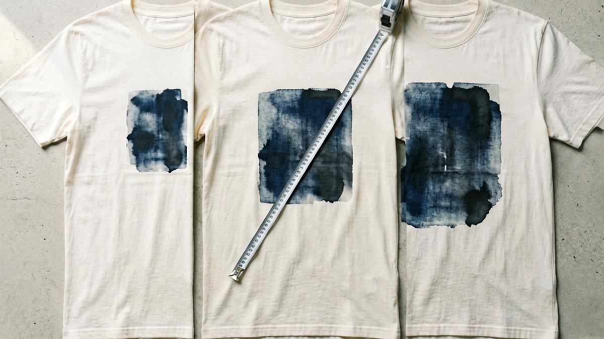
Almost every graphic tee falls into one of three bands. Knowing which one you are buying is more useful than knowing which character is on it.
Left-chest, roughly two to four inches. Reads as a uniform detail or a workwear patch. It is legible only to people who already know the reference, which is exactly its appeal — it functions as a quiet signal rather than a statement, and it survives being layered under a jacket because the print sits above the buttoning line.
Mid-chest, roughly six to nine inches. The most flexible band and the one most vintage band tees occupy. Big enough to read across a room, small enough that the shirt still looks like a shirt with a graphic rather than a graphic with sleeves. If you own one anime tee, this is the size that goes the most places.
Full-front or oversized panel, twelve inches and up. Maximum impact and minimum flexibility. It dominates any outfit it is in, it fights with patterned outerwear, and it is unambiguously event wear. Correct for the convention floor on August 25, considerably louder than the room at a dinner afterwards.
Back prints deserve their own note, because they behave differently from everything above. A large back print is invisible to the person you are talking to and fully visible to everyone behind you, which makes it the one placement that is loud without being confrontational. It is also the placement that photographs best in crowds, which is why tour merch and event merch lean on it so heavily. Pairing a small left-chest mark with a large back print is the oldest trick in event apparel and still the most reliable.
How to match placement to the shirt you already own
Start with where the print sits vertically. On a well-placed tee, the top edge of a mid-chest graphic should land about two to three inches below the collar seam. Higher than that and it crowds your neck and rides up toward your chin in photographs; lower and it sinks toward your stomach and disappears entirely the moment you sit down. This single measurement is the most common failure in cheaply produced licensed tees, and you can check it on a flat table in five seconds.
Then account for the size of the shirt itself. A print does not scale when a garment does — most manufacturers run the same screen across the whole size run, so a nine-inch graphic that looks balanced on a medium looks stranded and undersized on an XXL. If you wear your tees deliberately oversized, size up in the graphic band as well, or accept that your print will read one step quieter than it does on the hanger.
Finally, think about what goes over the top. An open overshirt, chore coat or unzipped hoodie crops a full-front print down the middle and turns it into two disconnected halves, which almost always looks worse than either the whole graphic or none of it. If layering is your default, buy the left-chest or the back print and let the outer layer do the work. If you wear the tee alone, the mid-chest band earns its keep.
Where anime graphic tees go wrong
The first failure is treating high resolution as high quality. Anime artwork is often supplied as a detailed digital render, and a print that packs fine gradients and thin linework into a chest panel turns muddy after a handful of washes because the smallest details lift first. Fewer, heavier elements age better than many delicate ones, regardless of how good the source image looks on a product page.
The second is stacking references. One graphic tee is an interest; a tee plus a matching cap plus a keychain plus a tote is a costume, and it flips how strangers read you. The rule that survives contact with real life is one loud item at a time — if the shirt is a full-front panel, everything else you are wearing should be plain.
The third is buying for a single day. Event weeks generate a lot of apparel designed to be photographed once, with the date printed on it and nowhere to go afterwards. A dated shirt has a job for exactly forty-eight hours. A crest or a symbol from the same series has a job for years, and costs the same.
The Bottom Line
One Piece Day '26 streaming free on YouTube on August 22 and 23 means a lot of people will be reaching for an anime tee in a lot of different rooms. Before you pick one by character, pick it by coverage: left-chest for the quiet signal that layers, mid-chest for the shirt that goes everywhere, full-front or back print for the days you actually want to be seen from across a hall. Check that the graphic sits two to three inches under the collar, check that it was scaled for your size and not just for a medium, and keep the rest of the outfit plain. The artwork is the easy part — the proportion is what people actually read.
Frequently Asked Questions
When is One Piece Day '26 and how can I watch it?
One Piece Day '26 takes place on August 22 and 23, 2026, and the schedule was announced in early August. The main stage is being streamed worldwide on YouTube, so it is watchable internationally rather than being limited to attendees or to a single region's service. Separately, One Piece Fest runs in Los Angeles on August 25 and 26, the first time that event has been held in North America.
What size graphic print is best for an anime t-shirt?
For a shirt you want to wear beyond the event itself, a mid-chest print of roughly six to nine inches is the most versatile: it reads across a room but still looks like a shirt with a graphic rather than a graphic with sleeves. A two-to-four-inch left-chest print is the quietest option and layers under jackets cleanly. Full-front panels of twelve inches and up are event wear — high impact, low flexibility.
Where should a chest graphic sit on a t-shirt?
The top edge of a mid-chest graphic should sit about two to three inches below the collar seam. Placed higher, it crowds the neck and rides toward your chin in photos; placed lower, it drifts toward the stomach and vanishes when you sit down. Lay the shirt flat and check the gap before buying, because inconsistent placement is one of the most common defects in cheaply produced licensed tees.
Do graphic prints get bigger on larger t-shirt sizes?
Usually not. Most manufacturers run the same screen across the entire size range, so a graphic that looks balanced on a medium can look small and stranded on an XXL. If you wear tees deliberately oversized, either choose a larger print band than you think you need or accept that the graphic will read one step quieter on you than it does on the product photo.
One Piece Day '26 Hits Aug 22 — Pick Your Anime Tee by Print Size | Stryxen Studio Blog

 Sylvie Vance