What Is a Retro Vintage Graphic Tee and Why Does It Never Go Out of Style?
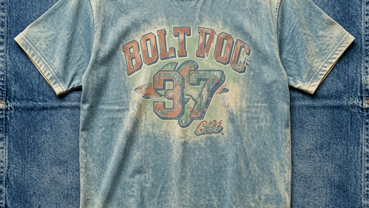
A retro vintage graphic tee is a new shirt engineered to look 20–40 years old — faded base color, distressed print, and a motif borrowed from a specific decade (most often the 90s). The look is...
Sylvie Vance
•
A retro vintage graphic tee is a new shirt engineered to look 20–40 years old — faded base color, distressed print, and a motif borrowed from a specific decade (most often the 90s). The look is built from garment dye, mineral or enzyme washes, and ink that's been cracked on purpose. It keeps coming back because each generation redraws the same eras through a new lens, and a well-made repro lets them wear that reinterpretation without paying genuine vintage prices.
What Actually Defines a Retro Vintage Graphic Tee
Three things have to be true at once for a tee to read as retro vintage instead of just old: the color has to look lived-in, the print has to look broken-in on day one, and the motif has to be anchored to a specific decade the wearer can name. Skip any one of the three and you've either got a regular graphic tee or a genuinely old shirt — not a retro vintage one.
The color comes from a finishing process. The most common are garment dye (dyeing the finished tee rather than the yarn, which gives an uneven, faded look), mineral wash (washing with pumice or special stones that knock pigment out of the fabric in patches), and (a softer, biodegradable wash that gently fades the surface). Each one leaves a different signature: mineral wash is patchy and high-contrast, garment dye is more uniform but softer, enzyme wash is the most subtle.
enzyme wash
The print is almost always plastisol ink that's been deliberately distressed — either by adding a cracking agent to the ink formula, by tumbling the printed tees with stones, or by sanding specific areas before curing. The result is a print that looks like it's been through a hundred wash cycles but the fabric underneath is brand new. That's the whole point: the *appearance* of age without the structural weakness of actual age.
Genuine Vintage vs Retro Reproduction
There's a meaningful difference between a genuine vintage tee — a shirt actually manufactured 20, 30, 40 years ago — and a retro reproduction, which is a new shirt made to look vintage. They overlap in style, but they don't overlap in price, scarcity, or care requirements.
Genuine vintage is rare. The cotton is heavier (often 220+ GSM because older mills ran thicker), the stitching is single-needle, the tags are screen-printed onto the neck rather than woven in, and the prints were made with older plastisol formulas that actually do crack over time. A genuine 90s tee will have soft, thin spots in the cotton and print loss that's real — not designed in. That's also why authentic vintage costs 5x to 20x more than a new repro.
Retro reproductions are how most people actually wear the look. They use modern cotton (180–220 GSM, more consistent hand-feel), modern cut, and modern print techniques that simulate the same worn aesthetic. The upside is price, sizing consistency, and availability. The downside is that not every "vintage" reproduction is well-made — cheap ones use a printed fade pattern that washes off after three cycles. The Stryxen Studio collection uses real garment dye and ink-cracking techniques rather than surface printing, so the aged look is in the fabric and ink, not just on top of it.
Design Motifs That Read as Retro (1970s Through Y2K)
The motifs are what make a retro tee instantly readable. There are roughly four decades worth of visual vocabulary to draw from, and each one has its own signatures.
1970s: oversized collegiate lettering, varsity stripes, faded earth-tone palettes, surf and skate graphics, hand-drawn typography, sun-faded yellows and oranges.
1980s: bold geometric color blocks, MTV-era neon, breakdancer and boombox iconography, ironic brand logos, primary-color varsity crests.
1990s: oversized tour merch fonts, distressed band logos, plaid and flannel visual references, washed-out pastels, simple two-color prints on heavyweight cotton — this is the era most "retro vintage" tees reference.
Y2K (late 90s–early 2000s): chrome typography, cyber and glitch motifs, translucent color washes, butterfly and dollar-sign graphics, low-rise-era cropped cuts.
Fabric and Finishing: How the Worn Look Gets Made
The "vintage" in retro vintage is engineered. It isn't a happy accident — it's a sequence of deliberate finishing steps applied to a new tee. Understanding the sequence helps you tell a well-made retro tee from a cheap one.
The base is almost always ring-spun cotton, 180–220 GSM. Ring-spun yarn is smoother and stronger than open-end yarn, which means the fabric can take the abrasion of mineral washing without falling apart. The tee is sewn first, then dyed as a finished garment (rather than yarn-dyed before weaving). Garment dye produces the uneven fade — seams stay slightly darker because they absorb less dye, and high-friction zones like the shoulders fade faster in subsequent washes.
Next comes the print step. Plastisol ink is laid down through a screen, and either a cracking additive is mixed into the ink or the print is tumbled with pumice stones to break the surface. A well-made retro tee will have distress that follows the fabric's natural folds and seams — a cheap one will have distress in obviously random spots that don't make sense visually.
Finally the tee is enzyme-washed to soften the hand-feel and lock in the fade. Enzyme washes use biological agents to gently break down surface fibers, which is what makes a brand-new retro tee feel like it's already broken in. Total finishing time is usually 60–90 minutes of processing after the basic tee is sewn — that's why well-made repros cost more than blank tees with a graphic printed on top.
Outfit Formulas That Make a Retro Tee Look Intentional
Retro tees look best when the rest of the outfit agrees with the era of the print. Pairing a faded 90s band tee with sharp modern techwear makes the tee look like a costume. Pairing it with wide-leg jeans, beat-up Converse or New Balance, and an open flannel makes it look like a wardrobe you actually live in. Three formulas that work.
Formula 1 — The 90s standard. Faded retro tee, loose straight-leg or slightly baggy jeans in a mid-wash, beat-up white sneakers, optional open flannel in autumn. This is the safest formula and the one most commonly associated with the look. Works for almost every body type and every venue.
Formula 2 — The Y2K remix. Slightly cropped or fitted retro tee (often an intentionally small size for that late-90s silhouette), low-rise cargo or wide-leg jeans, chunky sneakers or platforms, tiny shoulder bag. This is louder and more trend-forward — great for nightlife, less great for offices.
Formula 3 — The 80s athletic. Retro tee tucked or half-tucked into high-waisted relaxed trousers or chinos, vintage running shoes (New Balance 550s, retro Adidas), and a bomber or tracksuit jacket. This is the formula that lets a retro tee dress up without losing its edge.
Key Takeaways
Three signals = retro vintage. Faded/washed color, distressed print on day one, and an era-anchored motif (70s, 80s, 90s, or Y2K).
Genuine vintage ≠ retro reproduction. Vintage is rare, heavier, and real-worn; repros use modern cotton and engineered finishing to simulate the same look at a normal price.
The aging is engineered. Garment dye, mineral wash, ink-cracking, enzyme wash — in roughly that order — is what produces the worn look on a new shirt.
Match the outfit to the era on the print. 90s tees want 90s-adjacent silhouettes; Y2K tees want Y2K-adjacent proportions; the era mismatch is what makes a retro tee look like a costume.
Mid-weight ring-spun cotton (180–220 GSM) is the base. Lighter fabric won't survive mineral washing; heavier fabric won't drape right.
Why the Look Keeps Coming Back
Retro vintage graphic tees don't go out of style because the eras they reference are deep enough to keep getting rediscovered. Each new generation redraws the 90s or the Y2K era through its own lens, and a well-made repro lets them wear that reinterpretation without paying vintage prices or gambling on eBay. The Stryxen Studio collection leans into the best-executed version of this: real garment dye, ink that's been cracked on purpose, and motifs that point clearly to a decade — so the tee reads as intentional, not as something you grabbed because it was on sale.
Frequently Asked Questions
What makes a graphic tee look retro vintage?
Three things working together: a faded or washed color on the base fabric, a print that already looks cracked or sun-bleached on day one, and a motif borrowed from a specific decade — typically the 70s, 80s, 90s, or early 2000s. Skip any of the three and the tee either reads as a regular graphic tee or as genuinely old, not retro vintage.
How can you tell a real vintage tee from a reproduction?
Genuine vintage is heavier (often 220+ GSM), has single-needle stitching, screen-printed neck tags, and real print loss that came from decades of wear. Reproductions are new shirts with engineered fading and cracking. Vintage costs significantly more and runs in limited sizes; reproductions are widely available in modern sizing at normal graphic tee prices.
What fabric is best for a retro vintage graphic tee?
Mid-weight ring-spun cotton, 180–220 GSM. Ring-spun yarn is strong enough to survive the mineral and enzyme washes that produce the faded look, and the 180–220 GSM range gives the soft drape retro tees need without going transparent.
How do you style a retro vintage graphic tee?
Match the rest of the outfit to the era on the print — 90s tees want baggy mid-wash jeans with white sneakers, Y2K prints want low-rise cargos and chunky sneakers, and 80s athletic motifs want high-waisted relaxed trousers with a bomber. Era-matching is what separates intentional from costume.
What Is a Retro Vintage Graphic Tee and Why Does It Never Go Out of St | Stryxen Studio Blog

 Sylvie Vance