What Is a Pop Art Graphic Tee and How Did It Become a Streetwear Icon?
A pop art graphic tee is a t-shirt printed with imagery rooted in the 1950s–60s pop art movement — bold color, comic-strip linework, screen-printed dots, soup-can iconography, and blown-up...
Sylvie Vance
•
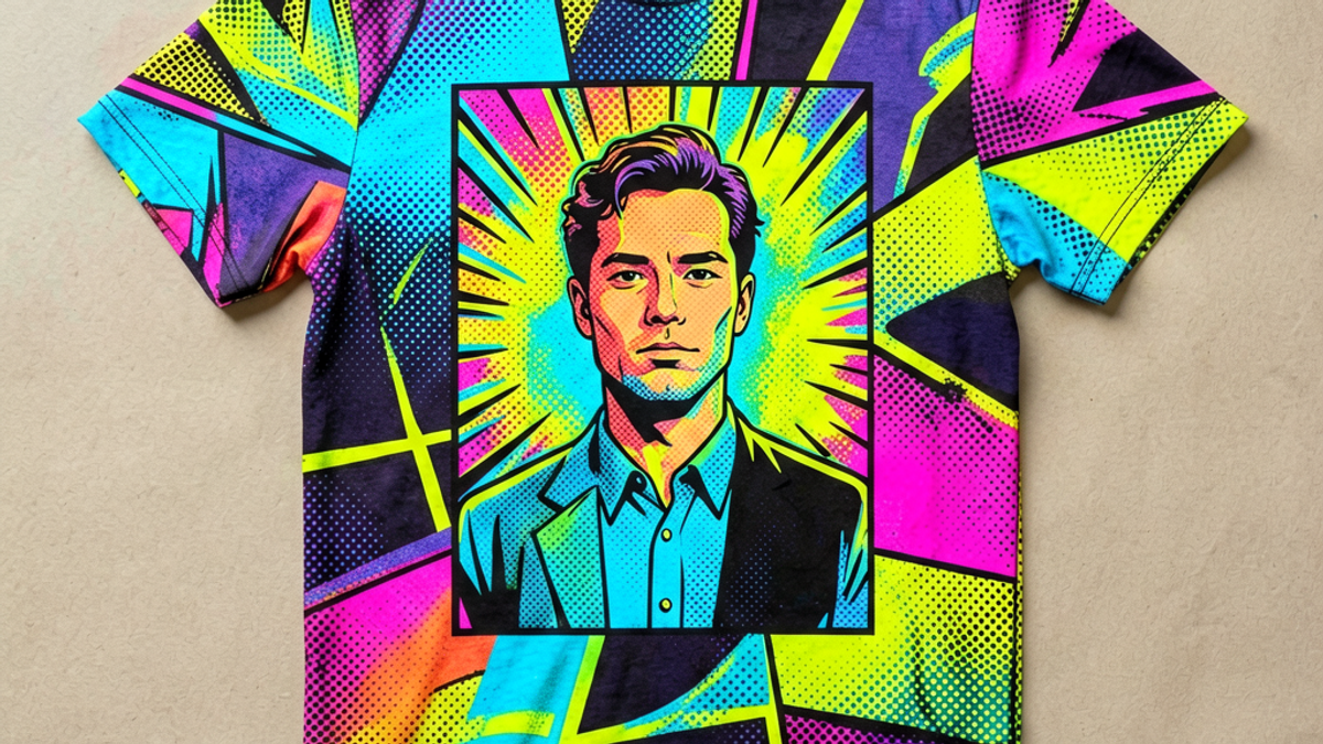
A pop art graphic tee is a t-shirt printed with imagery rooted in the 1950s–60s pop art movement — bold color, comic-strip linework, screen-printed dots, soup-can iconography, and blown-up consumer branding. It became a streetwear icon because pop art was always about democratizing art, and printing it on a tee was the most direct way to finish the job. The best pop art graphic tees read like wearable gallery prints — not merch, not nostalgia, but actual art history on cotton.
Key Takeaways
Pop art graphic tees descend from Warhol, Lichtenstein, and Hamilton — the movement, not the aesthetic.
The icons are recognizable at a glance — soup cans, comic panels, Ben-Day dots, and bold sans-serif type.
Quality screen printing is non-negotiable — the look depends on flat color and crisp edges, which only screen printing delivers.
The style cycles every 8–12 years but never fully goes out — collectors rotate in and out.
Modern pop art tees mix original references with new commentary — pure rip-offs read as costume.
The Origins of Pop Art on Cotton
Pop art started as a reaction against abstract expressionism. Where the abex painters wanted to elevate painting to philosophy, pop artists wanted to drag art back to the grocery store — Campbell's soup, comic books, Marilyn Monroe, Brillo boxes. Andy Warhol screen-printed the same image dozens of times to ask what made something "art" versus "product." Roy Lichtenstein enlarged comic-strip panels and hand-painted Ben-Day dots to question where high culture ended and low culture began. Richard Hamilton defined the movement in 1957 with a collage that included a literal bodybuilder holding a lollipop.
The jump to t-shirts happened within a decade. Screen printing, the same technique Warhol used for his silkscreens, was cheap enough by the late 1960s to print runs of a few hundred tees. Early adopters were art students, gig promoters, and political activists. By the 1970s, pop art tees were a mainstream product — the smiley face, the peace sign, the bold sans-serif protest slogan. The aesthetic had become portable.
Why It Became a Streetwear Icon
Pop art and streetwear share the same instinct: take imagery from elsewhere, recontextualize it, and wear the result as a statement. When streetwear codified itself in the 1990s and 2000s, pop art was an obvious visual reference — bold, recognizable, politically charged, and culturally loaded. Brands like Stüssy, Obey, and later Supreme built entire visual languages around pop art DNA: high-contrast color, hand-drawn type, appropriated iconography.
Pop art also ages well in a way most graphic tee trends don't. A Warhol Marilyn tee from 2026 reads as art history, not fashion. A meme tee from 2024 reads as expired. The difference is that pop art references visual culture deep enough to outlast any specific joke — and screen printing, done right, preserves the look for decades.
How to Spot a Quality Pop Art Tee
Three filters separate real pop art graphic tees from knockoffs. Print method: must be screen printed (or high-quality discharge), not cheap vinyl or digital mockups. Pop art depends on flat color and crisp edges, which only screen printing delivers at scale. Color palette: should use 4–6 high-contrast colors maximum, in the Lichtenstein-Warhol tradition. Tees with rainbow gradients or photorealistic effects are doing something else. Reference depth: the best pop art tees comment on the original — recolor it, remix it, or pair it with a contemporary icon. Pure reproduction without commentary reads as costume.
If a pop art graphic tee passes all three filters, it has the same longevity as the original art it references. If it fails on print method, the colors fade and the edges crack within a season. If it fails on palette, it stops looking like pop art the moment you put it on. The style is unforgiving — either it reads as the real thing, or it doesn't.
How to Wear It Without Costume
Pop art tees are loud by design. The styling trick is to keep everything else quiet — black or indigo jeans, plain sneakers, minimal jewelry. The tee does the visual work; the rest of the outfit stays out of the way. Layering a pop art tee under a solid flannel or chore coat also works, especially in cooler months, because the graphic peeks through without fighting other patterns.
Avoid the temptation to load up on references — pop art tee, pop art socks, pop art hat, pop art tote. One strong pop art piece per outfit is plenty. Anything more starts to look like a uniform. The same principle applies to color coordination: let the tee dictate the palette. If the tee is red, yellow, and black, build the rest of the outfit around two of those three tones. The eye needs somewhere to land.
Pop Art's Influence on Contemporary Streetwear
Pop art's DNA is more visible in streetwear than in any other category. The appropriation techniques Warhol pioneered — taking mass-media imagery, recontextualizing it, repeating it until the meaning shifts — became the core method for streetwear graphics. Brand logos are repeated until they're ironic. Comic-strip panels are enlarged until they lose their narrative and become pure imagery. Consumer products (soup cans, soda bottles, cigarette packs) are elevated to design objects. Every streetwear graphic tee that uses bold flat color, high contrast, and appropriated iconography is operating in a Warhol-derived tradition, whether the designer knows it or not.
The influence runs both ways. Pop art movements are usually defined by a handful of canonical images; streetwear graphic tees have produced their own canonical references in the past two decades. The Stüssy signature, the Obey Andre the Giant, the Brain Dead creature — each has become recognizable enough to function like a Warhol Campbell's soup can in the contemporary streetwear vernacular. Future pop art shows will likely include streetwear graphics alongside traditional fine art references, treating the categories as part of the same conversation.
For buyers, this means pop art graphic tees are wearing a tradition, not just a style. The best pieces acknowledge that lineage through design choices — color palettes that echo mid-century printing, typography that nods to Lichtenstein's hand-drawn lettering, motifs that quote consumer branding in the Warhol register. Pieces that just look "pop art" without those references tend to date quickly. Pieces that engage with the tradition tend to last. Wearable art history is a longer shelf than wearable trend.
If you're building a pop art graphic tee rotation, the most durable pieces are the ones that read as art criticism as much as clothing. A tee that comments on consumer culture ages better than a tee that simply borrows consumer imagery. The difference is intentionality — the best pop art streetwear asks a question; the worst just quotes a picture.
Pop Art Tees Versus Generic "Bold" Graphic Tees
There's a meaningful difference between a pop art graphic tee and a generic bold-graphic tee that happens to use high-contrast color. The pop art piece references a specific visual tradition with a documented history; the generic piece borrows the surface aesthetics without engaging the underlying intent. Both look similar in thumbnails; both feel different in person and age differently over time.
Pop art tees tend to age well because the references stay recognizable. A Warhol quote is still legible fifty years later; the meaning has shifted but the imagery hasn't lost its cultural resonance. A generic bold-graphic tee ages less reliably because its design is anchored to whatever current aesthetic was dominant when it was made. When the aesthetic shifts, the piece starts to feel dated rather than classic.
For buyers building a rotation around pop art tees, the long-term value comes from pieces that engage the tradition with intent — tees that add commentary, that remix rather than reproduce, that treat the medium as art rather than decoration. Stryxen Studio and a small handful of independent labels design with this intentionality in mind, producing pieces that hold up across trend cycles rather than dating with them.
The Bottom Line
Pop art graphic tees are wearable art history, not fashion novelty. They earned their status by being the most direct expression of a movement that was already about democratizing imagery. The tees that last are the ones printed on quality cotton with proper screen printing, in palettes and references that respect the originals. For buyers who want pop art DNA without the costume — pieces that treat the movement as starting point, not costume — the Stryxen Studio collection builds every drop with the same filters.
Frequently Asked Questions
What is a pop art graphic tee?
A pop art graphic tee is a t-shirt printed with imagery from the 1950s–60s pop art movement — bold color, comic-strip linework, screen-printed dots, soup-can iconography. The aesthetic comes from Warhol, Lichtenstein, and Hamilton; the tees are wearable descendants of that visual language.
Why are pop art graphic tees so popular?
Pop art and streetwear share the same instinct: take imagery from elsewhere, recontextualize it, wear it as a statement. Pop art also ages well — references deep enough to outlast specific jokes. That combination of cultural depth and visual boldness is rare in graphic tee design.
How do you know if a pop art tee is good quality?
Three checks: print method must be screen printing or discharge (not vinyl or cheap digital), color palette should be 4–6 high-contrast tones maximum, and the reference should comment on the original art rather than just reproduce it. Tees that pass all three age like the art they reference.
How should you style a pop art graphic tee?
Keep everything else quiet — black or indigo bottoms, plain sneakers, minimal jewelry. The tee is the visual lead; the rest of the outfit supports it. One pop art piece per outfit is plenty, and the tee should set the palette for the rest of the look.
What Is a Pop Art Graphic Tee and How Did It Become a Streetwear Icon? | Stryxen Studio Blog

 Sylvie Vance