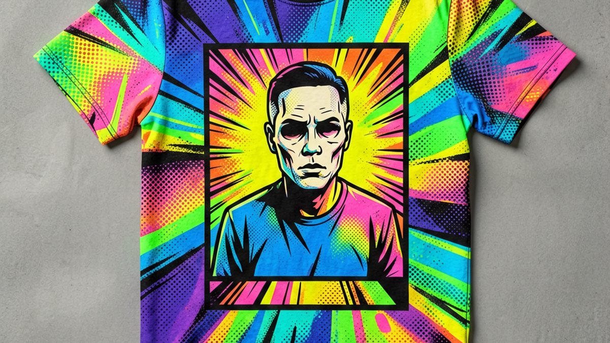
What Is a Pop Art Graphic Tee and How Did It Become a Streetwear Icon?
A pop art graphic tee is a printed T-shirt that borrows the visual language of 1960s pop art — halftone dots, comic-book panels, neon palettes, and ironic imagery — and turns it into streetwear....
Sylvie Vance
•
A pop art graphic tee is a printed T-shirt that borrows the visual language of 1960s pop art — halftone dots, comic-book panels, neon palettes, and ironic imagery — and turns it into streetwear. It is recognizable in two seconds: bold, graphic, slightly satirical, and visually loud in a way a plain logo tee never is. It became a streetwear icon because pop art's whole point was making high-art ideas wearable, and streetwear did the same thing a generation later with skate and hip-hop culture.
Key Takeaways
Definition: a tee that uses pop art visual devices — halftones, panels, neon, ironic imagery — as its graphic.
Lineage: Andy Warhol's silkscreens and Roy Lichtenstein's Ben-Day dots in the 1960s, picked up by 1980s underground clubs, then by 1990s streetwear.
Signature look: thick outlines, flat color, repeated motifs, oversized scale, and a print that fills the chest.
Why it survives drops: the references are evergreen, and the bold graphics look strong on phone photos and social feeds.
How to wear it: let the tee be the only graphic in the outfit — pair with denim, cargo, or plain trousers and minimal sneakers.
From Andy Warhol and Roy Lichtenstein to the Runway
Pop art started as a reaction against abstract expressionism. Andy Warhol's Campbell's Soup Cans and Marilyn Monroe silkscreens in the early 1960s argued that everyday commercial imagery deserved the same treatment as fine art. Roy Lichtenstein took a different route — he enlarged and re-painted panels from romance and war comics, blow-up Ben-Day dots and thick black outlines and all.
Both moves — the elevation of commercial imagery and the borrowed language of comics — turned out to be perfect raw material for clothing. By the late 1970s and into the 1980s, boutique designers in London and New York were silkscreening Warhol-adjacent motifs onto tees for the club crowd. By the early 1990s, skate brands and hip-hop labels had adopted the same visual grammar: thick outlines, comic-book lettering, ironic graphics. The runway caught up later — Christopher Kane, Jeremy Scott, and a long list of streetwear-leaning designers have all released pop-art collections in the last fifteen years.
Not every bright printed tee is pop art. The genre has a small set of visual signatures that separate it from regular graphic tees, vintage reproductions, or pure logo tees.
Halftone dots. The Ben-Day dot is the giveaway. Small, evenly spaced colored dots used to simulate skin tone or shading in cheap newsprint comics. On a tee, halftones show up as a texture across the whole print — usually in red, blue, or yellow over a darker base.
Comic-book panels. A pop art tee often frames the graphic inside a rectangular border, like a panel pulled from a comic page. Sometimes you see a speech bubble, a sound effect (POW, ZAP), or onomatopoeia stacked over the image.
Flat, saturated color. No gradients, no realistic shading. Each color block is one flat value — red is red, yellow is yellow. This is what gives pop art its poster-like quality and what makes the prints read so cleanly from across a room.
Ironic or borrowed imagery. Soup cans, celebrities, consumer products, dollar bills, comic-strip heroines. The subject matter is recognizable and usually commercial. Pop art tees riff on this — a brand mascot drawn in Ben-Day dots, or a fake product label treated as fine art.
Oversized scale. Pop art prints usually fill the chest. A small left-breast pop art print is almost an oxymoron — the genre is built on graphic impact, not subtlety.
Why Pop Art Graphics Keep Returning in Drops
Pop art tees come back in cycles — almost every two or three years a streetwear brand will release a pop-art drop, sell out fast, and ride the moment. Three reasons it keeps working:
First, the references are evergreen. Warhol and Lichtenstein aren't tied to a year or a trend — their work is in permanent collections now, and the imagery has been in the cultural water for sixty years. A pop-art tee doesn't date the way a Y2K butterfly print does.
Second, the graphics read well on social media. A pop-art print is high-contrast, bold-colored, and instantly recognizable in a tiny Instagram thumbnail. Brands know this and lean into it — a pop-art drop is almost guaranteed to get reshared because the imagery does the work.
Third, the genre is collaborative by default. Pop art started as appropriation, and streetwear runs on collaboration. A pop-art tee lets a brand reference a legacy artist or movement without committing to a full collection — which means small drops stay fresh while still feeling like part of a bigger cultural conversation.
How to Style a Pop Art Tee Without Looking Costumey
The single biggest risk with a pop art tee is that the graphic is so loud the rest of the outfit competes and loses. Keep everything else quiet. Three formulas that work.
Pop art tee + straight-leg denim + low-top white sneakers. The safest baseline. The tee is the obvious focal point, the denim grounds it, the sneakers disappear. Converse Chuck 70, Reebok Club C, or Veja Esplar — any of these keep the look clean.
Pop art tee (tucked) + high-waisted wide-leg trousers + chunky sneakers. A more styled version. Tucking the tee and adding volume below makes the tee read like a deliberate statement rather than an afterthought. Keep the trousers solid — black, stone, navy — so the print stays the loudest thing.
Pop art tee under a plain chore coat or denim jacket. Layering with a solid outer piece lets you wear the print year-round. Skip the flannel over the tee — flannel adds its own pattern and the eye won't know where to land.
What to avoid: logo-heavy bottoms, printed sneakers, statement jackets, more than one outer layer, and accessories that fight the tee for attention. The whole point of pop art is the picture — let the picture win.
What Makes a Pop Art Tee Different From a Regular Graphic Tee
Every pop art tee is a graphic tee, but most graphic tees are not pop art. Three differences matter.
Source material. Regular graphic tees use logos, typography, photography, illustrations, or abstract graphics. Pop art tees specifically borrow from the visual language of 1960s pop art — halftones, Ben-Day dots, comic panels, screen-printed commercial imagery.
Treatment of color. Pop art uses flat, saturated, often non-realistic color. A regular graphic tee can be any palette — pastels, gradients, monochrome. A pop art tee almost always reads as bold, high-contrast, and a little louder than you'd expect.
Cultural register. A regular graphic tee can mean anything. A pop art tee is a reference — to Warhol, to Lichtenstein, to the club scene, to a moment in art history. Wearing one is a small intellectual move, not just a fashion one.
The Bottom Line
A pop art graphic tee is a printed T-shirt built on the visual grammar of 1960s pop art — halftones, comic-book panels, neon, ironic imagery, and a print that fills the chest. It's been a streetwear favorite for forty years because the references don't date and the graphics read well on every medium from a runway photo to a TikTok clip. Let the tee be the loudest piece in the outfit. The Stryxen Studio collection includes pop-art-influenced prints cut for everyday wear — bold graphics, fits that work solo or under a layer, and pieces that pair with what you already own.
Frequently Asked Questions
what is a pop art graphic tee
A pop art graphic tee is a printed T-shirt that uses the visual devices of 1960s pop art — halftone dots, comic-book panels, neon colors, ironic or borrowed imagery, and bold flat color — as its graphic. The result is louder and more graphic than a regular logo tee and is usually associated with streetwear drops and limited-edition prints.
who started pop art graphic tees
Pop art itself started with Andy Warhol and Roy Lichtenstein in the early 1960s. Pop art graphic tees as a fashion category emerged in the late 1970s and 1980s through boutique clubs and underground designers, then moved into skate and hip-hop streetwear in the early 1990s. Major fashion houses — Christopher Kane, Jeremy Scott, Moschino — have released pop-art collections since.
how to style a pop art t-shirt
Keep everything else quiet: straight-leg denim or solid trousers, low-top or chunky neutral sneakers, no printed bottoms or statement jackets. The pop art tee should be the only graphic in the outfit. You can tuck it into high-waisted trousers for a styled look or layer it under a solid chore coat or denim jacket for cooler weather.
what is the difference between pop art and graphic tees
All pop art tees are graphic tees, but most graphic tees are not pop art. Pop art tees specifically borrow from 1960s pop art — halftones, Ben-Day dots, comic panels, flat saturated color, ironic imagery. A regular graphic tee can use any visual approach: logos, typography, photography, abstract illustration. Pop art is recognizable as a specific reference.
What Is a Pop Art Graphic Tee and How Did It Become a Streetwear Icon? | Stryxen Studio Blog

 Sylvie Vance