What Is a Pop Art Graphic Tee and How Did It Become a Streetwear Icon?
A pop art graphic tee is a t-shirt printed with imagery drawn from the pop art movement — Warhol-style repetition, Lichtenstein-style Ben-Day dots, comic book panels, advertising iconography, or...
Sylvie Vance
•
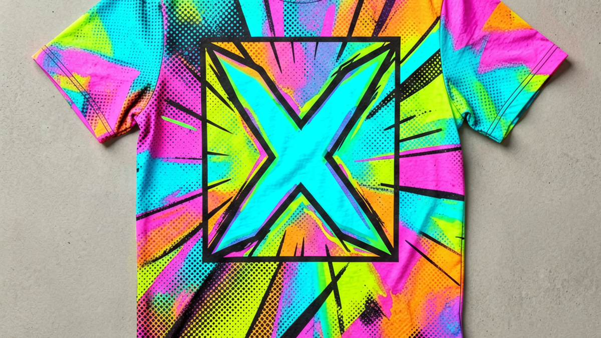
A pop art graphic tee is a t-shirt printed with imagery drawn from the pop art movement — Warhol-style repetition, Lichtenstein-style Ben-Day dots, comic book panels, advertising iconography, or bright commercial color palettes — translated onto a wearable blank. It is a specific subgenre of streetwear graphic tee with its own visual rules. The good ones treat the source art with respect; the bad ones just slap a Roy Lichtenstein quote on a $12 tee. Below, what defines the category, why it works, and how to tell the real interpretations from the cheap riffs.
Key Takeaways
Key Takeaways
Pop art tees reference a specific visual language. Warhol repetition, Lichtenstein dots, comic panels, advertising iconography — pick a lane.
Color palette is the loudest signal. Saturated reds, yellows, blues, and pinks. If the colors are muted earth tones, it's not pop art.
Original interpretations age better than direct copies. A brand that riffs on the movement in its own voice outlasts a brand that just prints a famous frame.
High-contrast prints work best. Pop art was built on commercial printing techniques — silkscreen, Ben-Day dots, halftones. The tee version needs the same graphic punch.
Pair with quiet pieces. Loud graphic on top, plain or muted everything else. The tee should be the focal point, not competing with busy pants or a noisy jacket.
What Pop Art Actually Means on a Tee
Pop art was a 1950s-60s movement that took commercial imagery — soup cans, comic strips, advertisements, celebrity photos — and elevated it to fine art. Andy Warhol's Campbell's Soup Cans and Marilyn Monroe prints, Roy Lichtenstein's Ben-Day dot comic panels, Richard Hamilton's collages. The streetwear version translates that visual language onto a t-shirt: repetition, halftone dots, saturated color, ironic celebration of commercial design.
A real pop art graphic tee doesn't just print a Warhol quote. It uses the visual language of pop art — the printing techniques, the color logic, the composition — to create something new. The best pieces feel like they could hang in a gallery and also work in a fit. The worst pieces just copy a famous image and call it a day.
The Visual Rules That Make a Pop Art Tee Work
Saturated color palette. Pop art was loud on purpose. The tee version should be loud too. Saturated reds, electric blues, acid yellows, hot pinks. Muted earth tones are not pop art.
Halftone and Ben-Day dots. The printing techniques that defined pop art (commercial silkscreen, halftone reproduction) are part of the visual signature. A pop art tee that ignores these reads as a regular graphic tee in pop-art colors.
Repetition and grid layouts. Warhol's soup cans. Lichtenstein's repeated panels. Repetition is the rhythm of pop art. A single image, no grid, no repetition — not pop art.
Commercial iconography, ironically or sincerely treated. Soup cans, celebrities, advertisements, comic book characters, brand logos. Pop art took the everyday and made it iconic. A pop art tee does the same.
The category also scales globally. Pop art's visual language is universal — you recognize the colors, the dots, the composition whether you're in Tokyo, São Paulo, or Berlin. That's why pop art tees are a perennial in streetwear: the language travels.
How to Spot a Quality Pop Art Tee
Original interpretation, not a direct print. A brand that takes pop art's visual language and creates something new is doing it right. A brand that just prints a Lichtenstein frame on a tee is doing it cheap.
Discharge or high-density print, not thin plastisol. Pop art needs punch. Thin printing flattens the saturation that makes the art work.
Color matching that respects the source. Pop art color palettes are specific. If the brand shifted the palette to "what's easier to print," the design has lost its reason for existing.
Boxy fit that frames the print. Pop art tees are statement pieces. The fit should hold the print, not fight it. Boxy relaxed cut, drop shoulder, body length that hits below the waistband.
The Bottom Line
A pop art graphic tee is one of the most expressive pieces in streetwear. The good ones translate a 60-year-old art movement into something wearable without losing the irony, the color, or the punch. The bad ones just steal famous frames and call it a tee. Filter by original interpretation, saturated color, real print technique, and boxy fit — the rest is just decoration.
Frequently Asked Questions
What counts as a pop art graphic tee?
A pop art graphic tee uses the visual language of the pop art movement — Warhol-style repetition, Lichtenstein Ben-Day dots, comic book panels, saturated commercial color palettes, advertising iconography. The design should be original or a respectful interpretation, not a direct print of a famous artwork. Saturated color and high-contrast printing are non-negotiable.
Are pop art tees still trendy in 2026?
Yes, but the trend has matured. The era of cheap Lichtenstein-rip tees is over. What works now is original pop art-inspired design — brands using the visual language to create something new. Saturated color, halftone prints, repetition, and ironic or sincere commercial iconography are all still relevant.
How do I style a pop art graphic tee?
Treat it as the focal point. Pair with quiet pieces — black or white pants, minimal sneakers, a clean jacket if the weather calls for it. Avoid busy patterns on the bottom half, loud outerwear, or statement accessories that compete with the print. The tee's job is to be the loudest thing in the fit.
What's the difference between pop art and streetwear graphic tees?
All pop art graphic tees are graphic tees, but not all graphic tees are pop art. Pop art is a specific subgenre with a specific visual language — saturated colors, halftone prints, repetition, commercial iconography. A graphic tee with hand-drawn illustration or typographic design is streetwear, but not pop art.
What Is a Pop Art Graphic Tee and How Did It Become a Streetwear Icon? | Stryxen Studio Blog

 Sylvie Vance