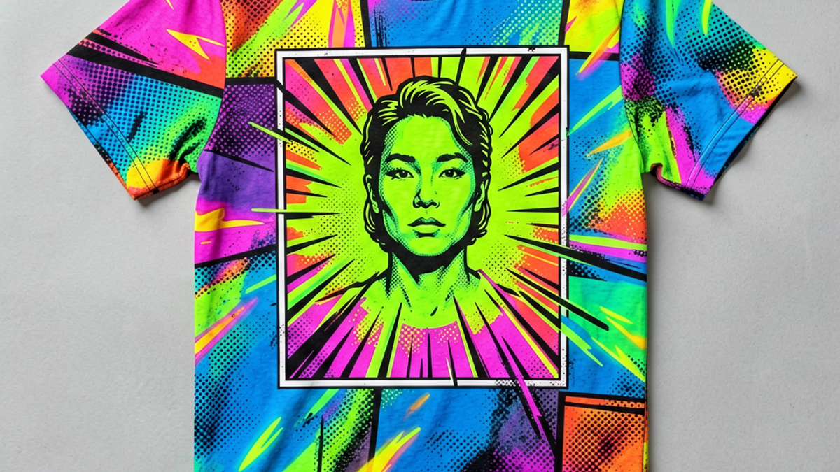
What Is a Pop Art Graphic Tee and How Did It Become a Streetwear Icon?
A pop art graphic tee is a t-shirt that borrows the visual language of 1960s pop art — comic-book halftones, neon ink, and satirical imagery — then prints it on cotton. The look traces a straight...
Sylvie Vance
•
A pop art graphic tee is a t-shirt that borrows the visual language of 1960s pop art — comic-book halftones, neon ink, and satirical imagery — then prints it on cotton. The look traces a straight line from Andy Warhol's silkscreens and Roy Lichtenstein's Ben-Day dots to the runways and streetwear drops of the last fifteen years. The strongest pop art tees feel less like a logo and more like a poster you can wear.
Pop art translates especially well to a tee because it was always a print medium. Warhol silkscreened Marilyn. Lichtenstein enlarged comic panels to poster scale. A cotton tee is essentially a wearable poster, so the genre's instincts already match the canvas. When the print quality and fabric weight are right, the result feels intentional rather than costumey.
Key Takeaways
Pop art graphic tees borrow halftones, panel borders, neon ink, and satirical imagery from 1960s fine art.
Warhol's silkscreens and Lichtenstein's Ben-Day dots are the two reference points every pop art tee inherits from.
The look returns roughly every decade because comic-book printing and graphic tees share the same DNA.
A good pop art tee uses two or three colors, clean registration, and a balanced composition rather than crowded imagery.
Treat the tee as the loudest piece in your outfit and let everything else stay neutral.
What Makes a Graphic Tee a Pop Art Graphic Tee
The shortest working definition: a graphic tee counts as pop art when its imagery, color palette, or composition is recognizable as a direct descendant of the 1960s pop art movement. That means comic-book halftone dots, bold flat color fields, screen-printed neon inks, panel borders, satirical portraits, or any combination of those. A generic floral tee is not pop art; a tee that lifts Lichtenstein's Ben-Day dot pattern and reprints it on cotton is.
Pop art was a deliberate rejection of the seriousness of abstract expressionism. It borrowed from advertising, packaging, comic strips, and celebrity photography — and made those commercial images feel like fine art by repeating them at scale and in unusual colors. A pop art graphic tee carries that same move: it takes an image that was meant to be glanced at and asks you to wear it on your chest.
From Warhol and Lichtenstein to the Runway
Andy Warhol's silkscreen practice is the clearest single thread. Warhol printed Campbell's soup cans, Marilyn Monroe, and Elvis the same way a print shop runs a tee: flat color, repeated image, registration dots if you look closely. The moment tees started using the same halftone dot pattern in the 1980s and again in the 2010s, they were quoting Warhol whether or not the brand said so.
Roy Lichtenstein went the other direction. He enlarged comic-book panels by hand, painted the Ben-Day dots back in as solid fields, and turned cheap newsprint into large-scale oil paintings. Pop art tees that mimic his hand-painted dots — usually via screen print on heavyweight cotton — are doing the same reversal in reverse: shrinking his scale back down to wearable size.
The runway link matters because it explains why pop art survived into streetwear. Designers in the late 2000s and early 2010s put Lichtenstein-style prints on the catwalk, then smaller labels started cutting similar graphics into tees at accessible prices. Once that happened, pop art went from museum-coded to daily wear, and the tees have never fully left rotation since.
Four elements show up in almost every pop art tee worth owning. First, halftone dots — the small dot patterns printers used to fake continuous tone in cheap newspapers. On a tee, halftones usually appear as a literal dot field in the print, and they instantly signal pop art to anyone who has seen a Lichtenstein reproduction.
Second, panel borders. Comic panels framed by a black keyline give a tee the structure of a page from a comic book. A single speech bubble inside a chest print, or a thick border around a back-print, reads pop art without needing to explain itself.
Third, neon and flat color. Pop art loves unmodulated, slightly synthetic-looking color — an electric pink, a pure cyan, a saturated yellow. A pop art tee should not look like a watercolor. If the colors feel airbrushed or printed flat, you are in the right zone.
Fourth, satirical or celebrity imagery. Pop art has always been interested in fame, brands, and consumer products. A pop art tee that lifts a logo, a product silhouette, or a celebrity portrait — and reprints it in flat ink — is doing what Warhol did with Brillo boxes. The closer the source is to something the viewer already recognizes, the better the tee works.
Why Pop Art Graphics Keep Returning in Drops
Pop art cycles back into fashion roughly every decade, and the cycle keeps shortening. The reason is simple: pop art is the one fine-art movement that was already designed for reproduction. It uses flat color, simple shapes, and high contrast — exactly the things that screen printing does best. When a brand wants a graphic that survives at tee scale, pop art is the easiest visual language to adapt.
There is also a nostalgia loop. Each generation rediscovers pop art through its own lens — the Warhol generation saw him as a downtown celebrity figure, the Y2K generation saw the Brillo boxes as retro irony, and today's streetwear audience sees pop art as a graphic-design vocabulary with serious history. Every rediscovery produces a fresh wave of tees because the vocabulary is so flexible.
Finally, pop art prints photograph well on social media. A flat, high-contrast design reads cleanly even on a small phone screen, and a brightly colored tee against a neutral background is the kind of image that earns saves. Brands notice when a graphic performs, and they keep bringing pop art back because it keeps paying.
How to Style a Pop Art Tee Without Looking Costumey
The single biggest styling mistake is treating the pop art tee as one element among many loud pieces. Pop art prints are designed to dominate the frame. Pair the tee with the quietest possible supporting cast: a clean black or indigo denim, a neutral trouser, a low-top sneaker in white or off-white. Let the print do the work and the rest of the outfit disappears, which is exactly the balance pop art wants.
Fit is the second lever. A pop art tee that is too small reads as costume — like you are wearing a novelty shirt. A pop art tee that is slightly boxy and lands mid-thigh reads as styled. If the brand runs slim, size up; if it runs oversized, take your normal size. Aim for a tee you could sleep in but that still has shoulder structure.
Color is the third lever. If the tee uses two or three colors, pick one of those colors and repeat it once in the rest of the outfit — a pair of socks, a cap, a sneaker accent. Do not echo the entire print. The repetition should feel like a considered choice, not a coordinated costume. When in doubt, default to all-black everything else and let the tee carry the only color in the room.
The Short Version
Pop art graphic tees are not a fad — they are a wearable print vocabulary that has survived six decades because the design language was already built for reproduction. Look for halftones, neon ink, panel structure, and a satirical reference. Pair the tee with quiet basics and you have a look that holds up off-runway. Browse the graphic tees in the Stryxen Studio collection to find a pop-art-coded design that earns a place in your rotation — cut and printed to wear as well as it photographs.
Frequently Asked Questions
what is a pop art graphic tee
A pop art graphic tee is a t-shirt whose print borrows the visual vocabulary of the 1960s pop art movement — comic-book halftones, bold flat color, panel borders, neon ink, and satirical imagery. The strongest examples feel like wearable posters rather than logos.
who invented the pop art style used on graphic tees
Pop art was developed in the late 1950s and 1960s by artists including Andy Warhol, Roy Lichtenstein, Richard Hamilton, and Claes Oldenburg. Warhol's silkscreens and Lichtenstein's Ben-Day dots are the two reference points that show up most often on modern graphic tees.
why are pop art graphic tees so popular
Pop art translates to a tee naturally because both use flat color, high contrast, and screen printing. The designs photograph well, read clearly at small sizes, and carry enough visual weight to anchor an outfit without needing complicated styling.
how do you style a pop art graphic tee
Treat the tee as the loudest piece in your outfit and let everything else stay neutral — clean denim, a neutral trouser, and low-top sneakers in white or off-white. Aim for a slightly boxy fit, repeat one print color once in the rest of the outfit, and avoid pairing it with other loud graphics.
What Is a Pop Art Graphic Tee and How Did It Become a Streetwear Icon? | Stryxen Studio Blog

 Sylvie Vance