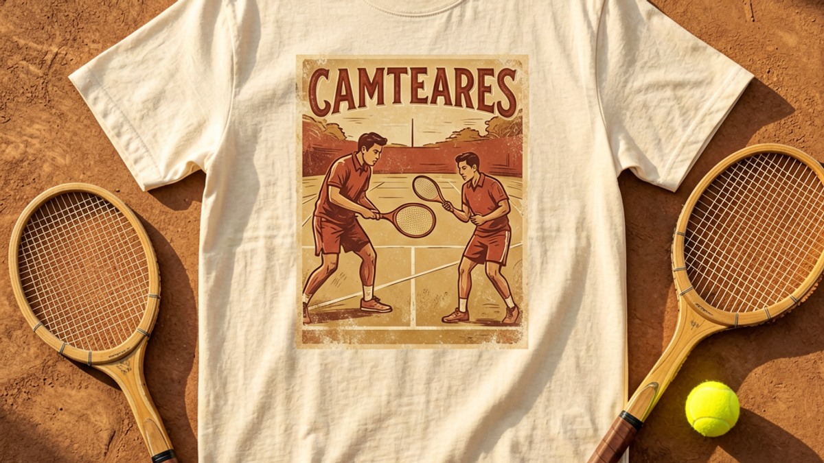
Naomi Osaka's Toronto Run Just Turned Tenniscore Into a Graphic Tee Trend
Naomi Osaka is trending across the US this week because of her Round of 16 match against Leylah Fernandez at the 2026 National Bank Open in Toronto, and the search spike is not only about tennis....
Sylvie Vance
•
Naomi Osaka is trending across the US this week because of her Round of 16 match against Leylah Fernandez at the 2026 National Bank Open in Toronto, and the search spike is not only about tennis. Tenniscore has officially crossed over from courtside kits into graphic tees, and the 2026 version is a heavyweight cotton tee with a racquet-sport print — not a polo, not a pleated skirt. That shift is why a trend that started at Wimbledon in June is still selling in August, and why it works with your existing streetwear rotation.
What actually happened in Toronto this week
The 2026 National Bank Open presented by Rogers reached its Round of 16 on Sunday, August 9, and the women's draw produced the kind of chaos that drives search volume. Aryna Sabalenka and Jessica Pegula were both upset, Elena Rybakina survived a scare to reach the quarter-finals, and Coco Gauff cruised past Alina Korneeva into her 25th career WTA 1000 quarter-final. The night session belonged to Leylah Fernandez against Naomi Osaka on Centre Court — a Canadian home-crowd storyline against the most fashion-covered player in the sport.
That combination is what pushed "naomi osaka" into Google's US trending list with 5,000-plus searches. Tennis fans wanted the result. Everyone else was there for the same reason the Toronto Star ran an opinion piece two days earlier headlined as an inside peek at Osaka's fashion sense: her outfits have become a bigger cultural event than most matches on the calendar.
Why Naomi Osaka drives tennis fashion into streetwear
No other active player has Osaka's crossover pull. In 2026 alone she opened the French Open in a custom Nike x Germanier look, sold out a Nike dress before her Wimbledon debut, and had her floral US Open kit leak online at the end of July — a design WWD read as a deliberate symbolic link between Japan and Washington's cherry blossoms. Fans argued about it for a week. That is not sportswear coverage. That is a drop cycle.
The mechanism matters for anyone shopping tees. Osaka's looks are covered by Vogue, Marie Claire, and Page Six rather than only by tennis media, so the visual language of the sport reaches people who have never watched a full match. Those people do not buy a pleated performance skirt. They buy the graphic that references it. Every athlete-driven fashion moment eventually finds its cheapest, most wearable expression, and for tennis in 2026 that expression is a printed cotton tee.
Tenniscore has also outlived the usual trend window. Forbes called it here to stay back in June around Wimbledon's new collection, ELLE built summer outfits around Wimbledon style in July, and Marie Claire flagged the sportiest trend in fashion as sticking around for fall in late July. A trend that survives from June to a fall-preview story is not a two-week meme — it is a durable print category.
What a tenniscore graphic tee actually looks like in 2026
The mistake is assuming tenniscore means literal tennis apparel. The graphic tee version borrows the sport's iconography and colour discipline, then puts it on a silhouette you can wear to a bar. Here is what is actually working right now:
Racquet and net geometry. Crossed racquets, string-bed grids, and court-line diagrams printed large and slightly off-centre. Graphic, not decorative.
Club-crest parody. Fictional club wordmarks, invented tournament years, and fake member badges printed small on the left chest with a bigger back hit.
Tournament-poster prints. Full-front illustrated posters in the style of a 1970s event bill — the single most requested tenniscore graphic of the summer.
Ball-yellow accents on white or cream. Optic yellow reads instantly as tennis. Used as a two-percent accent it looks intentional; used as the base colour it looks like a novelty shirt.
Clay-court palettes. Terracotta, warm sand, and off-white, which is why tenniscore tees keep selling into autumn while other summer prints die in September.
Fabric matters more here than in most print categories. Tenniscore is fundamentally a preppy reference, and preppy references collapse on thin, clingy jersey. A heavyweight cotton around 200-240 GSM with a slightly structured shoulder holds the print flat and keeps the shirt reading as considered rather than promotional.
How to style it without looking like you are heading to practice
The failure mode is obvious and common: a tennis-print tee with athletic shorts and court sneakers is a costume. Break at least one of those three references and the outfit becomes streetwear that happens to nod at tennis.
Swap the bottom. Pleated wide-leg trousers, loose selvedge denim, or a long canvas short worn below the knee. Anything that is not a performance short.
Swap the shoe. Leather sneakers, low-profile skate shoes, or loafers. The tee already carries the sport reference — the shoe does not need to repeat it.
Add one heavier layer. An unbuttoned camp collar shirt or an unlined chore jacket. It grounds the graphic and stretches the tee into September.
Keep the palette to three colours. Cream, one clay tone, one accent. Tenniscore reads as expensive because of restraint, and adding a fourth colour kills it.
Fit is the other lever. A tenniscore graphic on a genuinely oversized boxy tee reads as skate-adjacent streetwear; the same graphic on a regular fit reads closer to the preppy end. Both are valid, but pick one deliberately, because a mid-sized tee that cannot decide is the version that ends up looking like team merch.
Where tenniscore graphic tees go wrong
Three failure patterns show up constantly. First, over-literal prints: a photo-real tennis ball with no design idea attached is a souvenir, not a graphic tee. Second, the head-to-toe theme — a printed tee plus a headband plus a wristband plus court shoes reads as a costume within about a second. Third, using a real player's name or likeness on unlicensed product, which is both legally risky and visually cheap; the whole point of the club-crest and poster approach is that invented references look better than borrowed ones.
There is also a timing consideration. Osaka's Toronto week and the US Open build-up will keep tennis in the feed through early September, and the clay-court palette carries the look into autumn layering. But optic-yellow-heavy pieces are genuinely seasonal. If you want one tenniscore tee that lasts, buy the cream or terracotta one with a restrained graphic, not the neon one.
The Bottom Line
Naomi Osaka trending during the 2026 National Bank Open is a tennis story on the surface and a fashion story underneath. Her run in Toronto, alongside the Sabalenka and Pegula upsets and Gauff's quarter-final push, put the sport back in front of a general audience at exactly the moment tenniscore was proving it could survive past Wimbledon. The result is a print category with real staying power: racquet geometry, invented club crests, and vintage tournament posters on heavyweight cotton, in clay and cream rather than neon. Break the athletic-shorts-and-court-shoes reflex, keep the palette to three colours, and a tenniscore graphic tee stops being sports merch and starts being the most useful shirt in your summer-to-autumn rotation.
Frequently Asked Questions
Why is Naomi Osaka trending right now?
Osaka played Leylah Fernandez in the Round of 16 of the 2026 National Bank Open presented by Rogers in Toronto on Sunday, August 9, in a night-session match on Centre Court against a Canadian home crowd. The tie pushed her into Google's US trending list with 5,000-plus searches. Her fashion coverage amplified it — the Toronto Star ran a piece on her court style the day before, and her leaked floral Nike US Open kit had already been covered by WWD and Sports Illustrated at the end of July.
What is a tenniscore graphic tee?
It is a cotton graphic tee that borrows tennis iconography rather than actual tennis apparel. Typical prints include crossed racquets, string-bed grids and court-line geometry, invented club crests and member badges, and illustrated vintage tournament posters. Palettes lean cream, clay terracotta, and warm sand with small optic-yellow accents. The point is to reference the sport's visual language on a streetwear silhouette, not to wear performance kit off court.
Is tenniscore still in style for autumn 2026?
Yes, and the fashion press has been unusually consistent about it. Forbes called tenniscore here to stay around Wimbledon's new collection in June, ELLE built summer outfits around Wimbledon style in July, and Marie Claire flagged the trend as sticking around for fall in late July. The clay and cream palettes layer well under chore jackets and camp collar shirts, which is why the graphic tee version carries into autumn better than most summer prints. Neon-heavy pieces are the genuinely seasonal exception.
How do I wear a tennis graphic tee without looking like I am going to play?
Break the sport reference in at least one place. Pair the tee with pleated wide-leg trousers, loose denim, or a long canvas short instead of athletic shorts, and wear leather sneakers or loafers instead of court shoes. Add one heavier layer such as an unbuttoned camp collar shirt or an unlined chore jacket, and hold the whole outfit to three colours. Avoid stacking headbands and wristbands on top of the print, which is what turns the look into a costume.
Naomi Osaka's Toronto Run Just Turned Tenniscore Into a Graphic Tee Tr | Stryxen Studio Blog

 Sylvie Vance