How Should Men Style Graphic Tees Without Looking Sloppy?
The single biggest reason a graphic tee looks sloppy is fit and balance, not the shirt itself. A bold print only reads as "thrown on" when the silhouette is baggy in the wrong places, cropped at...
Sylvie Vance
•
The single biggest reason a graphic tee looks sloppy is fit and balance, not the shirt itself. A bold print only reads as "thrown on" when the silhouette is baggy in the wrong places, cropped at the wrong spot, or fighting the pants. Nail the shoulder seam, the torso length, and the proportion between top and bottom, and almost any graphic tee — even a loud one — looks intentional. Everything else is just the outfit around it.
Fit and Balance Fix 80% of Sloppy Outfits
Most "this tee looks terrible" problems are actually silhouette problems in disguise. The tee itself might be perfect, but it's been paired with pants that fight its shape, a jacket that cuts the body in half, or shoes that make the whole stack look bottom-heavy.
Before you blame the print, run a quick mental check on three things:
Shoulder seam sits at the bone. Not halfway down your arm, not pinched up at the neck. The seam is the anchor of the whole top half.
Torso length ends around the zipper fly. Halfway down the fly is fine. Below the front pocket is too long. Above the belt line on a tall frame is too short.
Top and bottom occupy different volumes. Either the tee is the roomy piece and the pants are tapered, or the tee is fitted and the pants have the volume. Two oversized pieces stacked on each other is what reads as "threw it on in the dark."
If those three are right, you've already beaten most outfits on the street. The formulas below assume this baseline and just dress around it.
Formula 1: Graphic Tee + Straight Jeans + Low-Top Sneakers
This is the default clean-casual formula for a reason: it has a defined top, a defined bottom, and a shoe that doesn't try to steal the show. The graphic tee gets to be the only loud thing in the frame, and the rest of the outfit stays out of its way.
Go for a mid-weight straight leg in a solid indigo or a washed black — nothing distressed, nothing stacked. Pair it with classic low-top sneakers in white, off-white, or a tonal grey. The shoes should sit close to the foot, not balloon above it. A simple leather belt in the same color family as the shoes pulls the whole thing together.
This works for almost any graphic: a band tee, a vintage slogan, an art print, a single chest logo. The reason it works is contrast discipline — the tee has the personality, the denim has the structure, the shoes have the quiet.
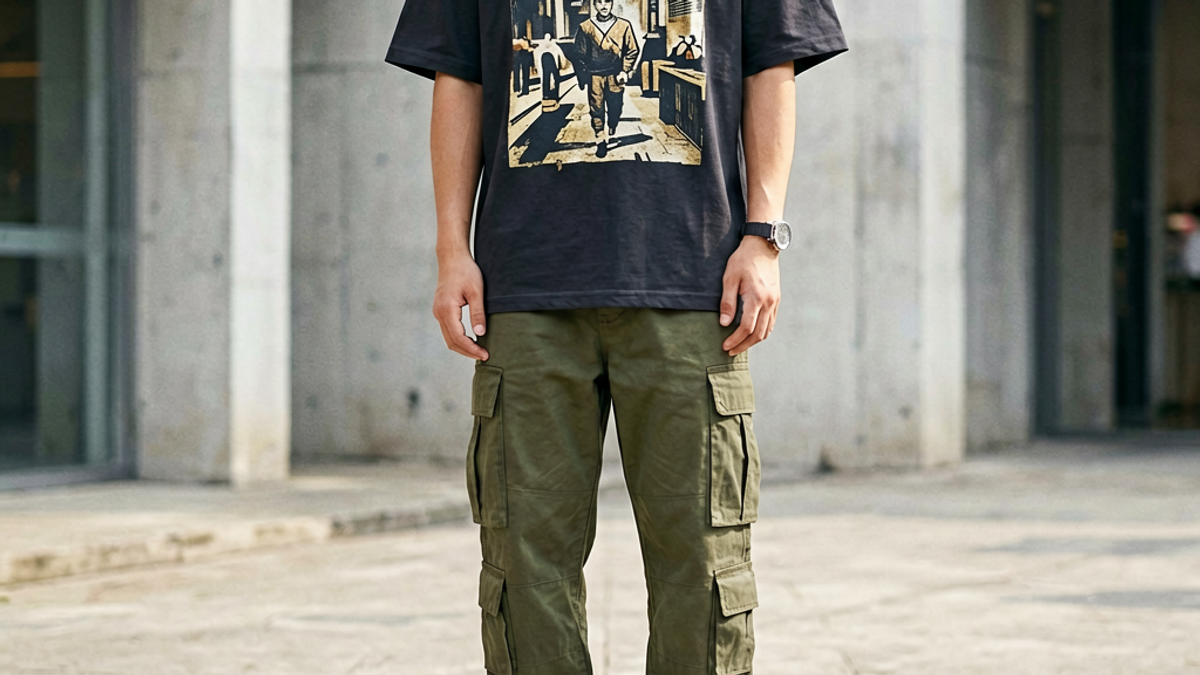
Formula 2: Oversized Graphic Tee + Wide-Leg Cargos + Chunky Shoes
When the silhouette you want is modern streetwear, not clean-casual, you flip the volume rule on its head. The tee goes oversized, the pants go wide, and the shoes go chunky — but everything still anchors to the body so you don't disappear into the fabric.
Pick an oversized tee that drops to the upper thigh, not the knee. You want the hem past the belt line, but not past your hand when your arm hangs. Pair it with wide-leg cargos that have a slight taper at the ankle so they puddle over the shoe instead of dragging on the ground. The taper is non-negotiable — true bell-bottom cargos swallow the shoe and make the whole stack look like a tent.
Shoes are where this formula lives or dies. You want chunky silhouettes: a heavy running shoe, a beefy court classic, or a high-top work-style sneaker. Thin minimalist sneakers disappear under the volume and make the outfit look top-heavy. The chunky sole adds the visual weight the wide pants need at the bottom to feel grounded.
Formula 3: Layered Under an Open Flannel or Chore Coat
Layering is how a graphic tee goes from weekend basic to actual outfit in a single move. The trick is treating the tee as a color block, not a statement piece, and letting the outer layer do the styling work.
Throw an open oversized flannel in a muted plaid, or a heavyweight chore coat in tan, olive, or charcoal, over the tee. Leave the flannel fully unbuttoned so the graphic is still the focal point, and let the hem of the tee peek out below the jacket by about two inches. Push or roll the jacket sleeves up to the forearm so the layered stack is visible at the wrist.
On the bottom, narrow it up — a straight or slim black jean, a tapered trouser, or a clean cargo. The top half is doing a lot of work here, so the bottom should stay quiet. Finish with the same low-top sneaker from Formula 1. The point of this look is the layered upper, not the shoe.
The Three Fit Rules That Matter More Than the Graphic
If you only have time to memorize one section of this article, make it this one. Fit beats print, every time. A $200 graphic tee in the wrong size looks worse than a $30 one that actually fits.
1. Shoulder seam. The seam where the sleeve meets the body should land right on the edge of your shoulder bone, not inside it and not falling off it. This is the single most expensive-looking detail on a man's top. Pull the tee out, look at yourself in a mirror with your arms relaxed, and check.
2. Sleeve length. On a short-sleeve tee, the sleeve should end roughly halfway down the bicep — high enough to show some arm, low enough to look like a deliberate cut. Sleeves that end at the elbow look like you borrowed a shirt from a larger friend. Sleeves that cap the shoulder look like you're about to do a set of pull-ups.
3. Torso length and width. The hem should fall around the bottom of the zipper fly, give or take an inch depending on your height. Width-wise, you want about two to three inches of ease through the body — enough to skim, not enough to billow. If you can pinch more than four inches of fabric at your side, it's too boxy. If there's no pinch at all, it's too tight for a graphic print to read correctly.
Sneaker Pairings: Low-Tops vs Chunky
Sneakers are the tiebreaker between a good outfit and a forgettable one, and the rule is simpler than the internet makes it: match the weight of the shoe to the weight of the silhouette.
Low-top, slim-profile sneakers (think classic court shoes, minimalist runners, retro basketball flats) work with anything slim or straight through the leg. They disappear into the outfit, which is what you want when the graphic tee is the focal point and the pants are doing the structuring.
Chunky sneakers (heavy retro runners, beefy skate shoes, work-inspired high-tops) need volume underneath them. Pair them with wide-leg cargos, stacked denim, or baggy tailored trousers. A chunky shoe with a slim pant looks like an accident — like you forgot to change after the gym. The shoe is asking for fabric to sit on, and you have to give it.
Color rule: match the sneaker to the belt, or match the sneaker to the dominant accent color in the graphic. One or the other. A free-floating third color reads as unconsidered.
Common Mistakes That Make Any Graphic Tee Look Sloppy
These are the outfit-killers I see most often, in roughly the order they show up on the street:
Stacking two oversized pieces. An oversized tee with baggy jeans and chunky shoes, no anchor anywhere, makes the body disappear. Pick one oversized piece per outfit and taper the rest.
Cuffing and bunching fabric on purpose. The "I just shoved my sleeves up" cuff looks great on a flannel and terrible on a tee. If you're going to roll tee sleeves, roll them once, evenly, above the elbow. Otherwise leave them.
Tucking a graphic tee into dress trousers. The print is doing casual, the trouser is doing formal, and the two never reconcile. Either tuck a plain tee into a tailored pant, or wear the graphic tee out with a casual pant.
Graphic tees with graphics on the back and the front. Pick one. A tee with a chest print and a back print competes with itself, and the eye doesn't know where to land. Single-print tees always look more intentional.
Worn-out shoes under a clean outfit. The shoes are the foundation. If the soles are smooth and the uppers are creased beyond recognition, the whole outfit drops a tier. Rotate or replace.
Key Takeaways
Fit and balance fix 80% of sloppy-looking outfits — shoulder seam, torso length, and top-vs-bottom volume.
Three core formulas cover almost every situation: clean-casual (straight jeans + low-tops), streetwear (wide cargos + chunky shoes), and layered (flannel or chore coat over a tee).
Match shoe weight to pant weight. Slim pants want slim shoes. Wide pants want chunky shoes. A mismatch always reads as accidental.
One loud piece per outfit. Let the graphic be the print, the pants be the structure, the jacket be the layer — don't make everything compete.
Tuck only when the pant and tee both want to be tucked. A graphic tee almost never tucks well into a tailored pant. A plain tee almost never looks right untucked into a short.
Build a Rotation Around a Few Good Tees
You don't need twenty graphic tees to look like you have it together — you need three or four good ones in fits that actually work for your body, and the formulas above to rotate them through. The Stryxen Studio collection is built around exactly this idea: heavyweight tees with prints that are loud enough to carry an outfit on their own, but cut cleanly enough that they don't fight the rest of your clothes. Pick one in a print you actually want to wear on a Tuesday, build the three formulas around it, and you've got a week's worth of outfits that all look like you tried — even when you didn't.
Frequently Asked Questions
How should a graphic tee fit on a man?
The shoulder seam should sit right at the edge of your shoulder bone — not inside it, not falling off. Sleeves should end around the midpoint of your bicep, never at the elbow. The hem should land around the bottom of your front zipper fly, and the body should have two to three inches of ease — enough to skim, not billow. If you can pinch more than four inches of fabric at the side, it's too boxy.
Can men wear graphic tees to a casual office?
Yes, if the rest of the outfit is doing the office-appropriate work. Pair the tee with a clean, dark trouser or a dark straight-leg jean, a simple belt, and a low-profile leather sneaker or minimalist court shoe. Layering a chore coat or an unstructured blazer over the tee is the move that makes it read as "considered casual" instead of "rolled out of bed." Avoid tees with offensive graphics, faded prints, or graphics on both the front and the back.
What shoes go best with graphic tees?
Match the shoe weight to the pant weight. Low-profile sneakers (classic courts, retro basketball flats, minimalist runners) work with straight or slim pants. Chunky sneakers (heavy retro runners, skate shoes, work-inspired high-tops) work with wide-leg cargos or stacked denim. Match the sneaker color to your belt, or to the dominant accent color in the graphic — not a free-floating third color. Thin minimalist sneakers with baggy pants always look unbalanced.
Are graphic tees still in style in 2026?
Yes — graphic tees have moved from a casual-only category into a core men's wardrobe piece, and 2026 has only reinforced that. The shift is in how they're worn: heavier-weight cotton, more confident prints, and a stronger preference for oversized-but-not-baggy silhouettes paired with wide-leg bottoms. Band tees, art prints, single-chest logos, and small back prints are all in rotation. The tees that look dated are the cheap thin cotton ones with screen-printed graphics on the chest and a stretched-out collar — the ones that look like they've been washed forty times. Buy heavier, wash colder, and they last.
How Should Men Style Graphic Tees Without Looking Sloppy? | Stryxen Studio Blog

 Sylvie Vance