Evangelion:95 Pre-Faded Its New Tees to 1995 — How to Judge Fake Aging
On August 7, Evangelion's official fashion label released its first Fall/Winter 2026 run: five graphic T-shirts built to look like they had survived since 1995. The detail worth borrowing is that...
Sylvie Vance
•
On August 7, Evangelion's official fashion label released its first Fall/Winter 2026 run: five graphic T-shirts built to look like they had survived since 1995. The detail worth borrowing is that the wear is a specification, not an accident — 6.5oz heavyweight cotton, fading printed into the body, distressing deliberately placed at the collar and cuffs. That is faux-vintage done as engineering rather than as a filter, and it gives you a checklist for judging every pre-distressed tee you are about to buy this autumn.
What Evangelion:95 actually dropped
Hypebeast reported the collection on August 7, with Essential Japan confirming two days later that this is the first Fall/Winter 2026 outing from the franchise's official apparel label rather than a one-off licensed capsule. The run is small and deliberately so: five T-shirts, each built around a single piece of Neon Genesis Evangelion imagery instead of a scattergun character grid.
The source material is specific enough to matter. The lineup pulls from End of Evangelion, the Episode 9 battle that fans have been quoting for three decades, the Mass Production Evas, and — the choice that gives the whole project away — a classic CD jacket, the sleeve art for Yoko Takahashi's "Soul's Refrain." That last one is not a scene. It is a piece of physical merchandise from the era, reprinted as a shirt. The label is not selling you the anime; it is selling you the objects that surrounded the anime in 1995.
Everything else in the collection follows from that framing. If the graphic is pretending to be a thirty-year-old artefact, the cotton it sits on has to pretend along with it, which is where the construction spec stops being marketing copy and starts being the actual product.
What "faux-vintage" means on a spec sheet
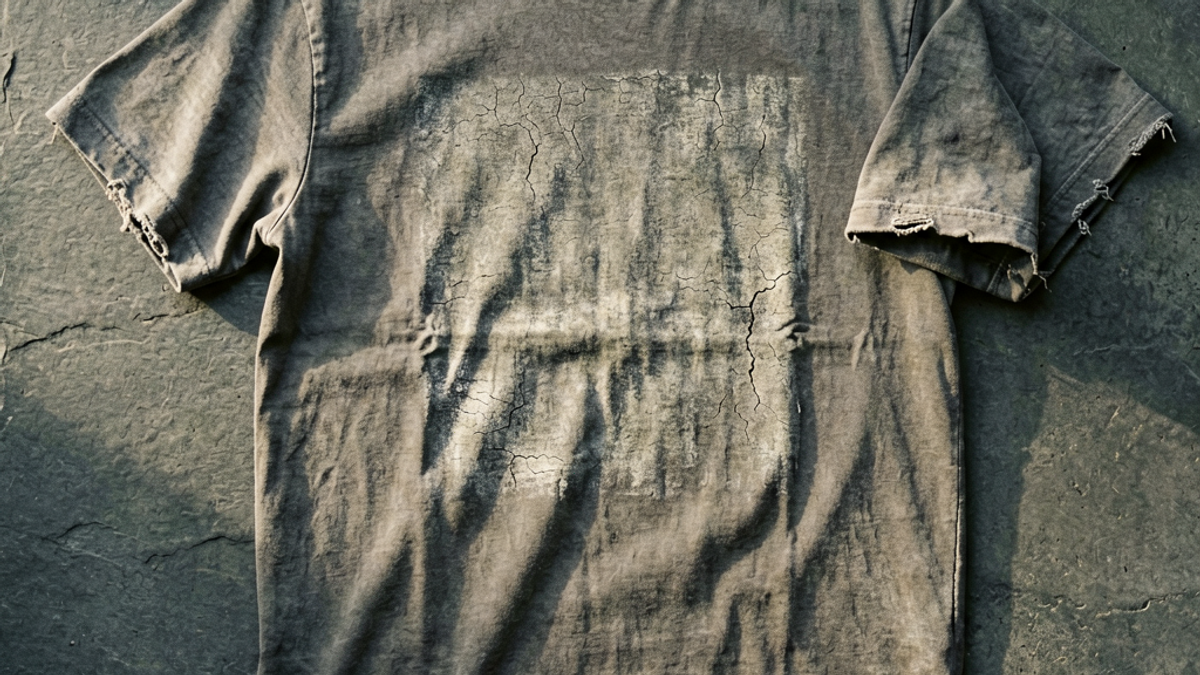
Most shoppers meet faux-vintage as a vibe word. Here it has numbers attached. Every shirt in the run uses a 6.5oz heavyweight 100% cotton body, described as smooth, durable and absorbent. Then the brand adds wear that would normally take years: body fading across the torso, and intentional distressing at the collar and cuffs. Crucially, the damage detailing is described as baked into the design rather than treated as a flaw.
Unpack those three decisions and you have the entire category. The weight comes first. 6.5oz is heavyweight territory — for reference, a standard fast-fashion tee lands somewhere around 4.2 to 5oz, and the difference is immediately obvious when you pick both up. Heavy cotton hangs off the shoulder instead of clinging to it, and it survives the fading process with structure left over. You cannot convincingly age a thin shirt, because thinness already reads as cheap rather than as old.
The fading is placed on the body, not sprayed evenly across the garment. Real thirty-year-old cotton does not lose colour uniformly; it loses it where light, friction and detergent got to it most. And the distressing is restricted to collar and cuffs — the two points that genuinely fail first on a shirt that has been pulled over a head a few thousand times. That is an observation about how garments actually die, translated into a production step.
How to tell convincing fake aging from cheap fake aging
Once you know what the technique is trying to imitate, judging it takes about fifteen seconds. The tells are consistent across price points and brands:
Check where the wear sits. Convincing distressing clusters at the collar, cuffs, hem and shoulder seams — the stress points. Wear scattered randomly across the chest is a texture overlay someone applied in software.
Look for fade gradient, not fade flatness. Genuine sun and wash fading moves gradually across a panel. A single uniform pale wash over the whole body is the giveaway of a garment dyed light and marketed as aged.
Weigh it. Aged-looking cotton under about 5oz is almost always thin cotton rather than worn cotton. The heavyweight base is what separates the two.
Inspect the print edge. A print meant to look decades old should show cracking or thinning within the ink itself, following the fabric weave. Ink that is perfectly crisp while the fabric around it looks ancient is an unresolved contradiction, and your eye catches it even if you cannot name it.
Ask whether the graphic earns the age. Faux-vintage on imagery that did not exist in the referenced era is just a wash. The Evangelion:95 run works partly because 1995 is genuinely when that artwork shipped.
That last point is the one most brands skip. The aging and the artwork have to agree on a date. When they do, the shirt reads as an artefact. When they do not, it reads as a costume of an artefact, and the effect collapses at conversational distance.
How to wear a pre-faded anime tee without it wearing you
A heavyweight faded graphic tee is a loud garment doing a quiet impression, and it styles best when you let it stay quiet. The fading has already done the work of softening the graphic, so the rest of the outfit does not need to compensate for anything.
Keep the palette narrow. A washed charcoal or bone tee wants mid-blue denim, black straight-leg trousers, or loose olive fatigues — one colour story, no competing prints. Because the shirt is 6.5oz, it holds a shape well enough to be worn untucked with a straight hem, and it will not disappear under an overshirt, which makes it a genuinely good layering base once October arrives. A half-tuck is optional and mostly depends on how the hem falls on you.
Footwear is where anime graphics usually go wrong. Skip anything technical or character-adjacent. Low-profile leather sneakers, plain canvas, or a simple boot let the graphic be the only reference in the outfit. The rule of thumb: one piece of fandom per outfit, and it should be the shirt.
If you own the real thing — an actual 1990s tee — do not wear it alongside a faux-vintage piece. The comparison is unkind to both, because genuine wear has an irregularity that no production process fully reproduces, and putting them side by side advertises exactly that.
Where the faux-vintage trend goes wrong
The failure mode is not fake aging itself. It is fake aging used to disguise a shortcut. Distressing hides poor print registration, uneven dye lots and cheap ink extremely well, which is precisely why so much of the market reaches for it. A shirt sold as pre-faded is a shirt whose defects are pre-excused.
The second problem is durability. A garment that has been chemically or mechanically aged before you buy it has spent some of its lifespan already, and collar distressing in particular is a head start on the failure that ends most T-shirts. This is why the heavyweight base is not a luxury detail. At 6.5oz there is enough material left after the aging process for the shirt to have a normal life; at 4.5oz, the aging is most of the life.
Third, the trend has an authenticity ceiling that fandom merchandise hits faster than most categories. A tee referencing 1995 artwork works because 1995 was real. The same treatment applied to a series that premiered last spring produces something slightly dishonest, and audiences that care about the source material are exactly the audience that notices.
Care matters more than usual here, too. Wash pre-faded cotton cold and inside out, skip the dryer where you can, and accept that the fade will continue — which is arguably the point. The design brief was a shirt that looks like it has been worn for thirty years. Actually wearing it is not a betrayal of that.
The Bottom Line
Evangelion:95's first FW26 drop is a useful reference point because it makes the technique legible: five shirts, 6.5oz cotton, fading built into the body, distressing placed where garments genuinely fail, and artwork that actually dates to the year the aging is imitating. Judge every pre-distressed tee you see this season on those same four axes — weight, fade placement, distress placement, and whether the graphic and the aging agree on a date. Faux-vintage done as engineering produces something worth owning. Faux-vintage done as a filter produces a thin shirt with an excuse.
Frequently Asked Questions
What is a faux-vintage graphic tee?
A faux-vintage graphic tee is a brand-new shirt manufactured to look decades old. The process typically combines a heavyweight cotton body with deliberate fading across the torso and intentional distressing at high-wear points like the collar and cuffs. Evangelion:95's FW26 run is a clear example: 6.5oz 100% cotton with the wear specified as part of the design rather than treated as a defect. The aim is a garment that reads as an artefact from a specific year — in this case 1995 — instead of a generically washed shirt.
How can you tell good pre-distressing from cheap pre-distressing?
Check four things. First, weight: convincing aged cotton is usually 6oz or heavier, because thin fabric reads as cheap rather than old. Second, placement: real wear concentrates at collars, cuffs, hems and shoulder seams, not randomly across the chest. Third, gradient: genuine fading moves gradually across a panel instead of sitting as one flat pale wash. Fourth, print consistency — the ink should show cracking or thinning that matches the age of the fabric around it. A perfectly crisp graphic on heavily aged cotton is the most common tell.
What is in the Evangelion:95 Fall/Winter 2026 collection?
The first FW26 drop, reported on August 7, 2026, consists of five graphic T-shirts, each built around one piece of Neon Genesis Evangelion imagery. The lineup draws on End of Evangelion, the Episode 9 battle, the Mass Production Evas, and the sleeve artwork from Yoko Takahashi's "Soul's Refrain" single. Every shirt uses the same 6.5oz heavyweight 100% cotton construction with built-in body fading and distressed collars and cuffs, which is what ties the five designs together as a collection.
How should you wash a pre-faded graphic tee?
Wash cold and inside out, and air-dry whenever practical. Heat is what accelerates both ink cracking and collar failure, and a pre-distressed shirt has already spent part of its structural budget before you bought it. Turning it inside out protects the print surface from abrasion against the drum. Expect the fade to keep developing regardless — that is consistent with the design intent rather than a sign of damage, provided the base cotton is heavyweight enough to carry it.
Free Shipping on All OrdersFree ReturnsNo Hidden Fees
 Sylvie Vance