Reacher Season 4 Lands August 12 — And Neo-Noir Graphic Tees Came With It
"Reacher season 4 release date" is trending across the US this week because Alan Ritchson's series returns to Prime Video on Wednesday, August 12, 2026. The style story underneath it is that...
Sylvie Vance
•
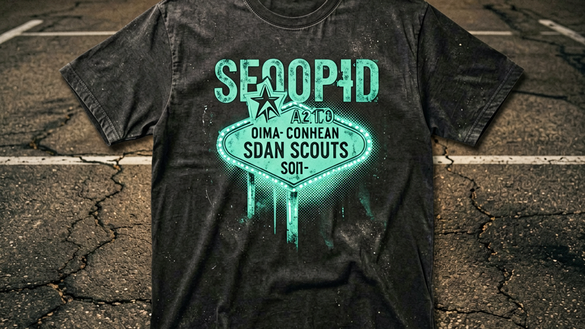
"Reacher season 4 release date" is trending across the US this week because Alan Ritchson's series returns to Prime Video on Wednesday, August 12, 2026. The style story underneath it is that neo-noir has quietly become a graphic tee category — washed black and faded charcoal cotton printed with highway signage, motel neon, and grain-heavy type, not a character's face. That distinction is the whole trend. It is also why these tees outlast the eight-week run of the show that popularised them.
What is actually happening with Reacher Season 4
Prime Video officially confirmed the date over the weekend, and the coverage cascade that followed is what pushed the query into Google's US trending list with a thousand-plus searches. Season 4 premieres on Wednesday, August 12, 2026, with the first three episodes dropping at once and the remaining five arriving weekly across an eight-episode run. Men's Journal and Yahoo published all eight episode titles back in mid-July, so the release schedule has been public for weeks — the spike is about the countdown finally reaching single digits.
The season adapts Lee Child's "Gone Tomorrow," which TV Insider confirmed when the trailer dropped at San Diego Comic-Con in late July. That is a deliberate tonal shift. "Gone Tomorrow" opens on a New York subway car at two in the morning and spends most of its length in surveillance-state paranoia rather than small-town brawling, and Men's Journal has already run two pieces on how the show diverges from the book. Amazon is confident enough to have renewed the series for a fifth season back in May, months before this premiere, with Jay Baruchel, Kevin Durand, Amanda Ip and Ciara Bravo joining that cast in late July. The Neagley spin-off follows on September 16.
Why an eight-episode thriller turns into a print category
Streaming premieres move merchandise differently than film releases do. A movie gets one weekend of visual saturation; a weekly-release series keeps the same colour palette and the same set of visual motifs in front of an audience for roughly two months. Every recap thumbnail, every trailer still, every screenshot circulating on social reinforces the identical aesthetic language. By week four, the look is legible enough that a graphic can reference it without naming it.
Reacher is an unusually clean case because its aesthetic is not really about the character. The books and the show share an obsessive set of images: interstate exits, roadside motels, bus depots at four in the morning, diner counters, a duffel-free drifter who buys new clothes rather than washing old ones. None of that is proprietary. Highway signage, sodium-vapour parking lot light and Greyhound-era type are public visual grammar that predates the series by fifty years. A tee can lean on all of it and remain an original design, which is exactly why this trend produces wearable garments instead of licensed merchandise.
That is the mechanism worth understanding. Fandom-driven print trends only produce good clothing when the source material's visual identity is broader than the source material itself. Tenniscore worked for the same reason. Superhero properties largely do not.
What a 2026 neo-noir graphic tee actually looks like
The category has settled into a fairly specific set of print conventions this year, and knowing them makes the difference between buying something you wear for three years and something you wear until the show ends:
Highway and route signage. Reflective-green interstate shields, mile markers, exit numbers and fictional route names rendered in the flat, slightly wrong typography of state highway departments. Fictional is important — a real route number reads as a souvenir.
Motel and diner neon. Vacancy signs, arrow marquees, coffee-shop scripts, usually printed as a single-colour line drawing rather than a glowing photographic render. The line-art version ages far better.
Grain and halftone. Heavy dot screens, deliberate print misregistration, and photocopier-degraded edges that read as 1970s paperback cover rather than clean vector work.
Restrained palettes. Washed black, faded charcoal, bone, and oxidised olive, with one accent — usually a sodium-orange or a cold signage green. Two-colour prints dominate; full-colour photographic prints are the outlier.
Back-heavy layouts. A small chest hit with a large back print is the dominant construction, borrowed from 1990s tour merchandise and now standard across the category.
What is conspicuously absent from the good versions: faces. Photographic portrait prints of a lead actor are the single clearest marker of licensed merchandise, and they date to the exact month the season aired. The prints that survive are the ones referencing the world, not the cast.
How to style it without looking like you bought it at the premiere
Neo-noir graphics are dark, high-contrast and visually loud, which means they fail in the opposite direction from most summer prints. The risk is not looking underdressed; it is looking like you are in costume as a person with a complicated past.
The reliable structure is to treat the tee as the darkest element and build everything else lighter. Washed black graphic, bone or ecru wide-leg trousers, and a mid-brown leather sneaker or a suede derby. The instinct to go all-black is what tips the outfit into moody-drifter territory. One heavier layer helps enormously — an unlined chore jacket in olive or a faded denim overshirt worn open — because it frames the print rather than competing with it.
For the back-print constructions specifically, fit matters more than usual. A large back graphic on a boxy heavyweight body needs the shoulder seam to sit at or just past your actual shoulder; if it drops halfway down your upper arm the print distorts across the sleeve join and the whole thing reads as a size mistake. Hold the outfit to three colours total and the shirt does the work.
Where neo-noir tees go wrong
The most common failure is literalism. A tee that prints a recognisable quotation, a character name, or a season number has committed to a timestamp, and the moment the cultural moment passes the garment becomes a receipt. The same graphic without the text stays wearable indefinitely, which is why the better designs invent their own route numbers and motel names rather than borrowing real ones.
The second failure is print quality on dark cotton. Light ink on washed black is genuinely difficult — it requires a white underbase, and cheap production either skips it, leaving a grey, muddy graphic, or lays it on so thick that the print sits on the fabric like a plastic patch and cracks within a dozen washes. If you can see the print from an angle as a raised glossy panel, it will not survive the year. Well-made versions feel like part of the shirt.
The third is chasing the premiere window. Season 4 runs eight episodes into early October, and the Neagley spin-off arrives September 16, so the aesthetic has a genuinely long tail this autumn — the palette layers under jackets far better than summer prints do. But buying three variations of the same idea in premiere week is how people end up with a drawer of shirts they associate with one specific month. One good one is the correct number.
The Bottom Line
Reacher Season 4 arriving on Prime Video on August 12 is a streaming story on the surface and a print story underneath. An eight-episode weekly run keeps a single visual palette in circulation for two months, and this particular show's palette — interstate signage, motel neon, halftone grain, washed black and bone — belongs to nobody, which is precisely what makes it usable. The tees worth buying reference that world rather than the cast: invented route numbers over real ones, line-art neon over photographic renders, two-colour prints over full-colour portraits. Build the outfit lighter than the shirt, keep it to three colours, check that the print feels like fabric rather than plastic, and a neo-noir graphic tee stops being premiere merchandise and starts being the shirt you reach for every autumn.
Frequently Asked Questions
When does Reacher Season 4 come out?
Reacher Season 4 premieres on Prime Video on Wednesday, August 12, 2026. The first three episodes drop together at launch, and the remaining five arrive weekly across an eight-episode season. Prime Video confirmed the date publicly over the weekend of August 8-9, 2026, which is what pushed "reacher season 4 release date" onto Google's US trending list. All eight episode titles were revealed in mid-July, and the Neagley spin-off follows on September 16, 2026.
What book is Reacher Season 4 based on?
Season 4 adapts Lee Child's "Gone Tomorrow," confirmed when the trailer debuted at San Diego Comic-Con in late July 2026. It is a tonal shift from earlier seasons — the novel opens on a New York subway car in the middle of the night and runs on surveillance-state paranoia rather than small-town confrontation. Coverage has flagged several deliberate changes from the book. Prime Video renewed the series for a fifth season back in May 2026, before this premiere aired.
What is a neo-noir graphic tee?
It is a cotton graphic tee built from crime-thriller visual grammar rather than from any specific licensed property. Typical prints include interstate and route signage, motel vacancy marquees and diner neon rendered as line art, heavy halftone grain, and deliberately degraded 1970s paperback typography. Palettes stay in washed black, faded charcoal, bone and oxidised olive with a single sodium-orange or signage-green accent. Small chest hit with a large back print is the standard layout.
How do I stop a dark graphic tee from looking like costume?
Make the tee the darkest thing you are wearing and build everything else lighter — bone or ecru trousers, mid-brown leather sneakers or suede derbies. All-black head to toe is what tips the look into costume. Add one open layer such as an olive chore jacket or faded denim overshirt to frame the print, hold the whole outfit to three colours, and check the shoulder seam sits at your actual shoulder so a large back graphic does not distort across the sleeve.
Free Shipping on All OrdersFree ReturnsNo Hidden Fees
 Sylvie Vance